It’s a No, No! See what you should avoid when trying to sell your paintings.
Watercolour illustration by Ada Fagan:
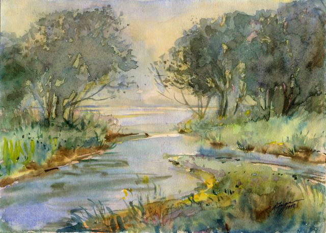
What do you think is wrong with this painting?
First, this painting will never sell!
Because it’s an overall green, blue and cool grey painting. All those colours are cool cold colours. And people don’t buy paintings that make them feel cold and unemotional.
Everything about it seems to fall flat and dismal. There is nothing dynamic and exciting about it.
But when a painting sells really fast…
People really get excited when a painting consists of contrasting cool and warm colours.
Why is that?
Because the contrast of the warm colours… in relation to the cool colours… makes an impact on people’s senses and emotions.
The WOW effect on people!
And instantly the effect on their senses and emotions makes them feel they must have it at any cost. And it’s very likely, with that, their money comes out of their pocket very quickly.
OK, so, what are the warm colours?
Warm colours are yellow, orange and red….and any colour that has one of those colours dominating in it. But that painting has yellow in it! Why didn’t it make a difference?
The ratio/contrast factor:
The sunny yellow in this painting just wasn’t enough to make this painting zing.
- You need more than just yellow! There must be more dramatic contrast of warm and cool colours.
- The range of colours in this painting, are just too close together on the colour wheel. Monochrome paintings generally aren’t dramatic enough.
- You need a direct complementary or analogous opposing colour in the painting to make it come alive.
- And besides that, you need more contrast of tones, to create a dramatic focal point in the painting.