Boring Background
I'm Blingit. An Aussie SAHM who spends my life at the ballet studio with my kids and in my spare time i paint.
I can be a bit on and off again with my art, fits of activity where i finish more paintings in a week that i do in 5 months at other times.
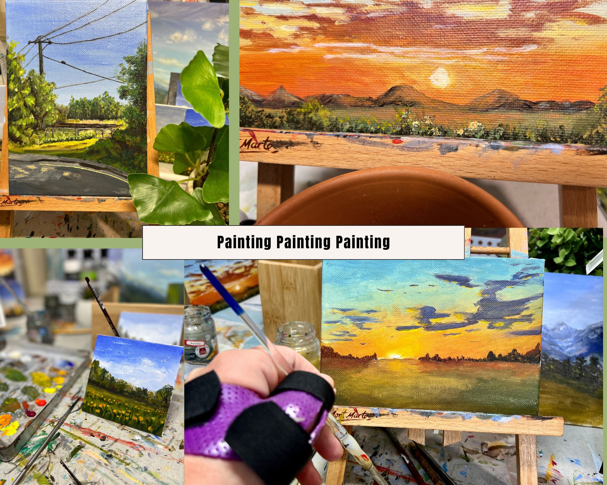
I had a hand injury 2 years ago that damaged the nerves in my painting hand. Its been a slow road and i think we are as good as we are going to get. It doesnt stop me painting, but it sure slows me down.
As a rule i have been painting Daily Paintings. They keep my hand in and also stop my anxiety over not being good enough. i have a time limit and thats it. if it doesnt work, i learn something and move on.
Blue Skies After the Storm — Painting Acrylic Skies the Easy Way
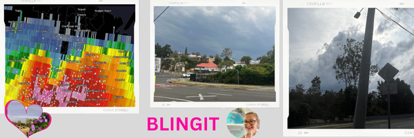
After yesterday’s wild Brisbane hailstorm that left tens of thousands without power, the blue skies have finally returned — gorgeous, hot, and thick with humidity (and about a million mozzies).
edit: there still ARE 10's of thousands without power... my husbands work just went down.. AGAIN...
It feels like the perfect time to talk about painting those calm skies that always seem to follow the chaos.
The Calm After the Storm
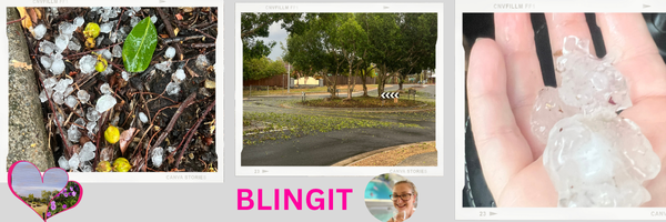
Yesterday’s storm was an absolute doozy. Golf-ball hail, thunder that shook the windows, and eucalyptus branches everywhere.
But today the sunlight’s back, the air’s sticky, and the sky is that blinding Queensland blue that makes you squint.
So I thought we’d have a little art chat about painting blue skies — although its fast changing here to storms again... sigh...
A Chat About Blues in Art
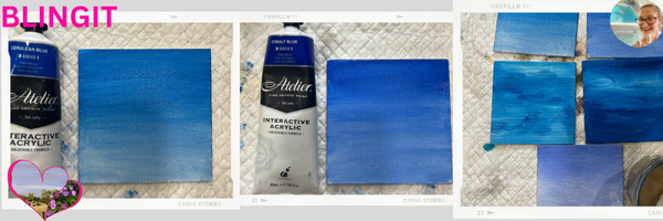
There are so many blues on the art shelf, but four are the usual suspects: Ultramarine, Cobalt, Cerulean, and Phthalo Blue.
Ultramarine Blue – warm, rich and a little bit dramatic. It’s the one you’ll see in Mediterranean seascapes, sunsets, and moody skies. It leans violet, so it’s perfect for late-afternoon light. This is the one i always run out of first...
Cobalt Blue – the workhorse of the blue world. A balanced, mid-tone blue that sits nicely between warm and cool. Often used in European or coastal scenes where you need that perfect “clean sky” feel.
Cerulean Blue – cool, soft and slightly greenish. Ideal for gentle morning skies or high-altitude light. Great for misty scenes and distant horizons. im a sucker for this in my water and oceans.
Phthalo Blue – the powerhouse. It’s super-strong and intense, used a lot in tropical and ocean paintings — think Great Barrier Reef turquoise meets deep sea. i hate this colour... lol... its hard to handle. i totally totally recomend giving this a bit of space. it overpowers VERY easily if you are not careful.
Each region of the world tends to have its “blue personality.” Unless you are me and grab for whatever and regret it later... Mediterranean painters lean into Ultramarine, northern landscapes favour Cobalt and Cerulean, and tropical scenes (like ours here in Queensland) love that punchy Phthalo hue.(but not me... i just "can't handle it.. lol"
i very much reccomend having these around your studio for "reminders"
My Personal Workflow
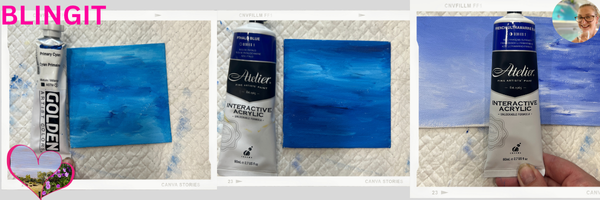
For my own skies, I’m almost always reaching for Ultramarine Blue and White.
It’s reliable, classic, and mixes beautifully.
To mute down the brightness, I’ll add just a tad of Burnt Sienna — never black.
It takes that harsh edge off without killing the colour. i find black muddies the sky. where the sienna (brown) but really a orange, does a good job to reduce the intensity of the blue.
Then I lighten gradually toward the horizon with more white, giving that sense of air and depth.
If I’m feeling fancy (or caffeinated), I’ll fade the Ultramarine down into a hint of Cobalt Blue near the bottom — it gives a lovely gradient that feels natural.
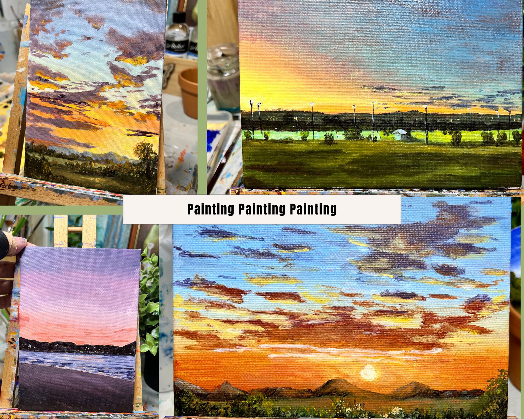
Painting Blue Skies with White Clouds
This post is all about blue skies with fluffy white clouds — those post-storm beauties that make you feel calm again.
For the clouds, I start with white mixed with just a touch of Burnt Sienna to dull it down.
That little warmth stops the whites from looking chalky or sterile.
Then I add purer white on top for the highlights where the sun hits, which makes the whole cloud pop.
When it comes to brushwork, I use round, circular strokes to build the body of the cloud and a small pointed brush to soften the edges.
Don’t over-blend — a bit of unevenness gives clouds that “drifting” feel.
A few quick tips for natural-looking clouds:
- Keep your edges soft at the bottom and brighter up top.
- Leave a bit of blue peeking through — clouds love negative space.
- Stand back every few minutes; clouds look different from a distance.
And if you accidentally make one look like a sheep or a dinosaur — lean into it, not everything needs fixing. 😂
Personally im still learning... however i have come such a long way from where i started... if you get to the end you will see what i mean with a older painting of mine... lol
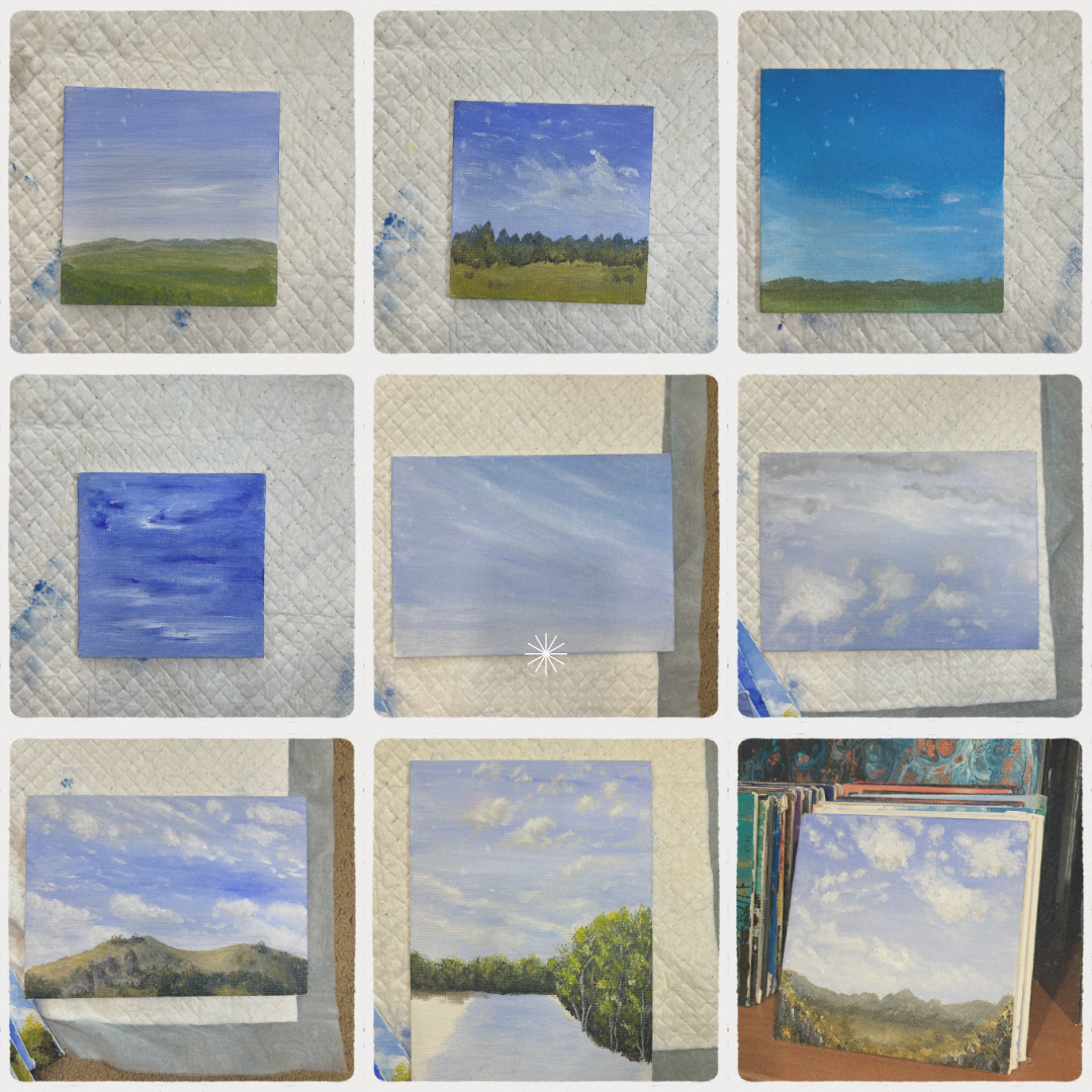
How to Practise Your Skies
Here’s a fun (and cheap) challenge: buy 100 tiny canvases from the dollar store.
Mine are anywhere between 5–8 cm squares — sometimes 15 cm if I’m feeling wild.
Then just paint skies.
Ten in a row. Don’t think too much, don’t try to make them perfect — just get your brush moving.
if each one takes longer than 1 min, you are doing it wrong... just wack the blue in... then spend 2-3 more mins doing a couple of clouds and moove on..
You’ll quickly learn how different blues behave, and bonus: you’ll end up with a stash of little sky studies ready to become backgrounds for future landscapes.
Next week you can grab one and practise adding grass, trees, or birds.
Learning from the Dodgy Ones
I’ve still got one of my really early sky paintings. It’s dreadful — I dragged half-mixed white paint across the blue and it looks like I mopped the sky. 😂
But those dodgy ones are gold. They show how far you’ve come and remind you to enjoy the process.

The Queensland Reality Check
Anyway, that’s my little sky chat for the day.
Time to go clean up after the doozy of a storm — the pool’s full of eucalyptus branches again, and the mozzies are out in force.
its also REALLY windy and REALLY hot... now im worried about fires.... sign
Good old Queensland weather, right? Sunshine one minute, sideways hail the next.then back to fires...
Thanks for stopping by — and as always,
Happy painting, everyone!
– Blingit 🎨
Suggested tags:
#gems #art #acrylicpainting #paintingprocess #australia #brisbane #creativejourney
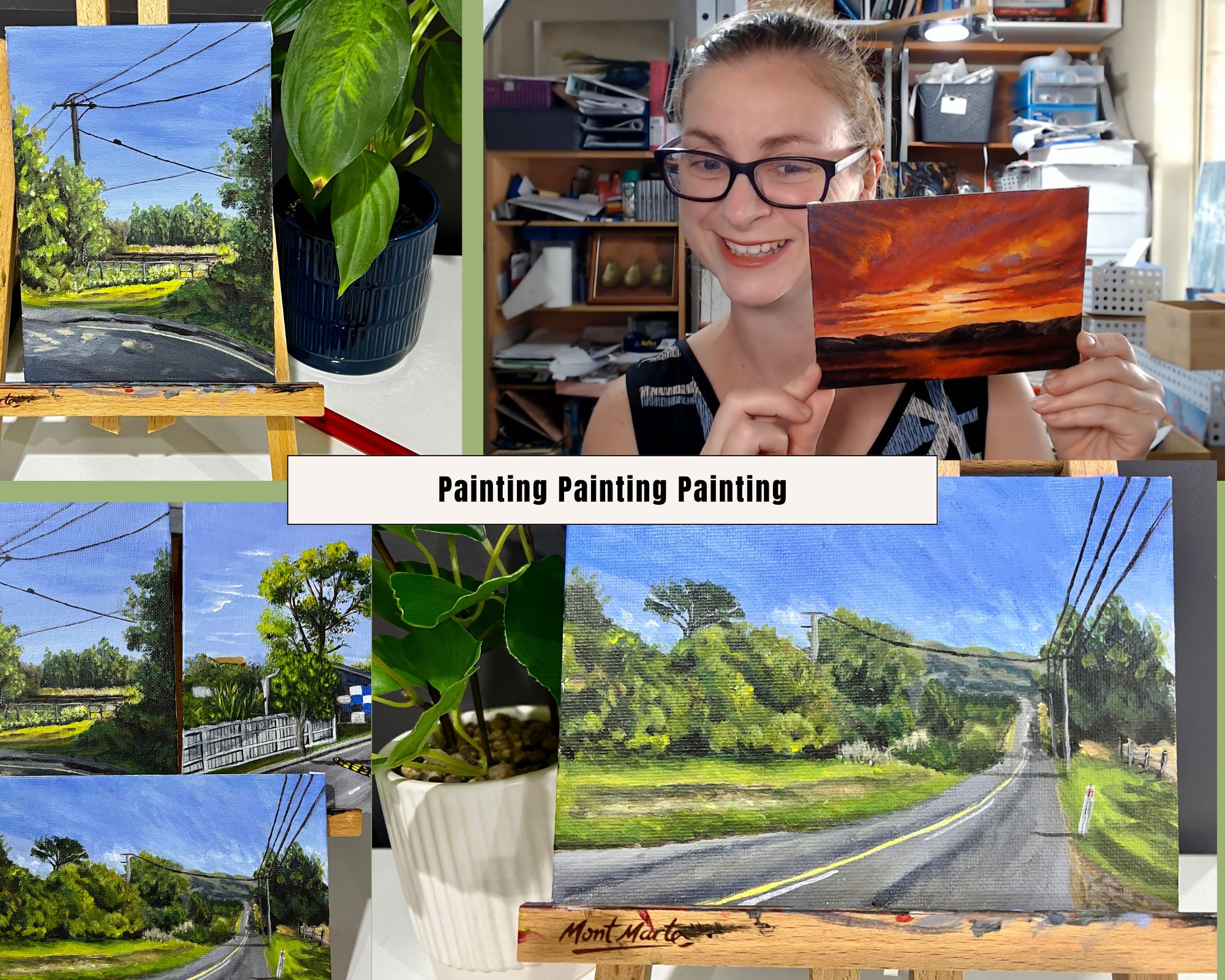
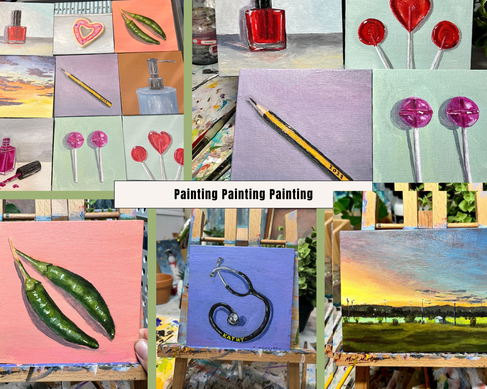
HERE ARE SOME OF MY RECENT DAILY PAINTINGS
LOVE AND LIGHT
HAPPY PAINTING