Settings screen of the Wallet we're building should be simple, provide a quick overview of what settings we have activated and also offer an option for our users to change certain things like fiat currency, improve security of the wallet as well as get some help or more information about something.
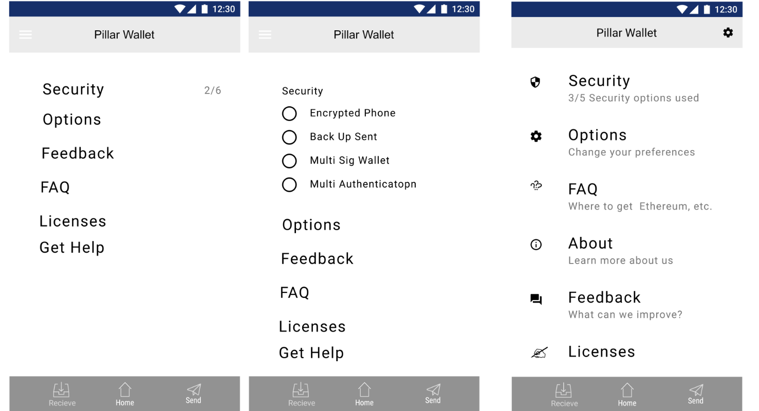
Here are quick sketches I made when deciding what style to go with. I wanted to make the security options visible and have them as check marks to show what measures were already taken. Though I decided that it'd be better off hidden at the end behind the Settings item so you'd see it only after clicking the Settings item.
The security settings screen is important. User should see that there are more options to secure his wallet if he didn't enable them all. That's why he'd also get a notification informing him to secure his wallet better after receiving his first payment nudging him into securing his funds so he won't have to have a horrible experience of losing them.
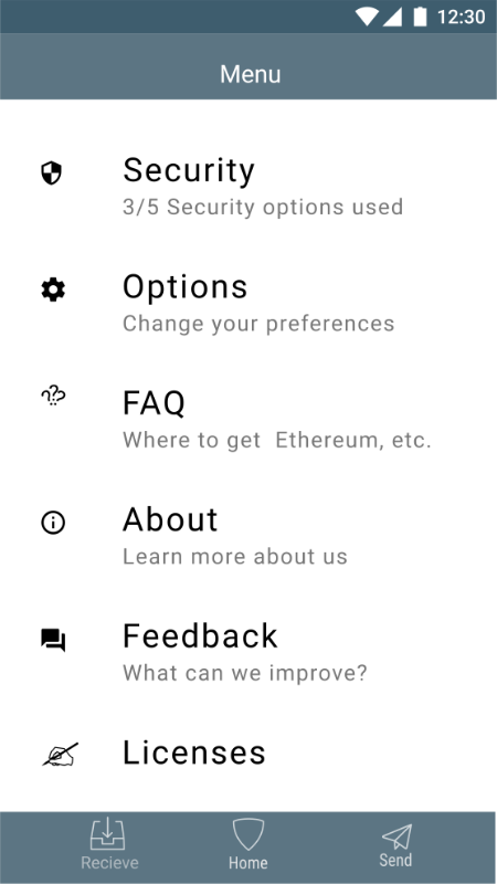
Final Screen
So at the end I decided to go with the hybrid iOS/Android style as I was designing the wallet to be usable on both platforms.
What do you think of this hybrid iOS/Android Style? Would you choose a different one?
Also, see the - Onboarding - User Stories and Introduction
Join me on the journey of learning and improving in Design. Together we can learn faster.
Design Thinking
An account dedicated to human-centered design with a dream of making crypto and block chain usable for an average Joe with a dream of working on crypto-related projects full-time.
You can look forward to - Learning Resources and Material - Design Breakdown and Critique - Inspiration - My Learning Journey - My Work - Other people's great work (resteemed) and some surprises plus any suggestions from the audience.