Street signs aren’t usually anyone’s idea of beauty, but today they became my subjects. I walked a little longer than usual and focused on the signages that pop up around roadworks and shared paths, temporary, practical, and surprisingly full of character. In black and white, their purpose turns into pattern, their warnings into typography, and their materials, metal, vinyl, plastic, become textures that speak.
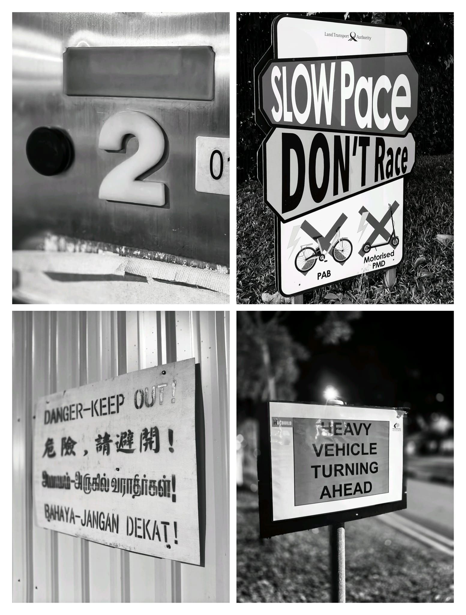
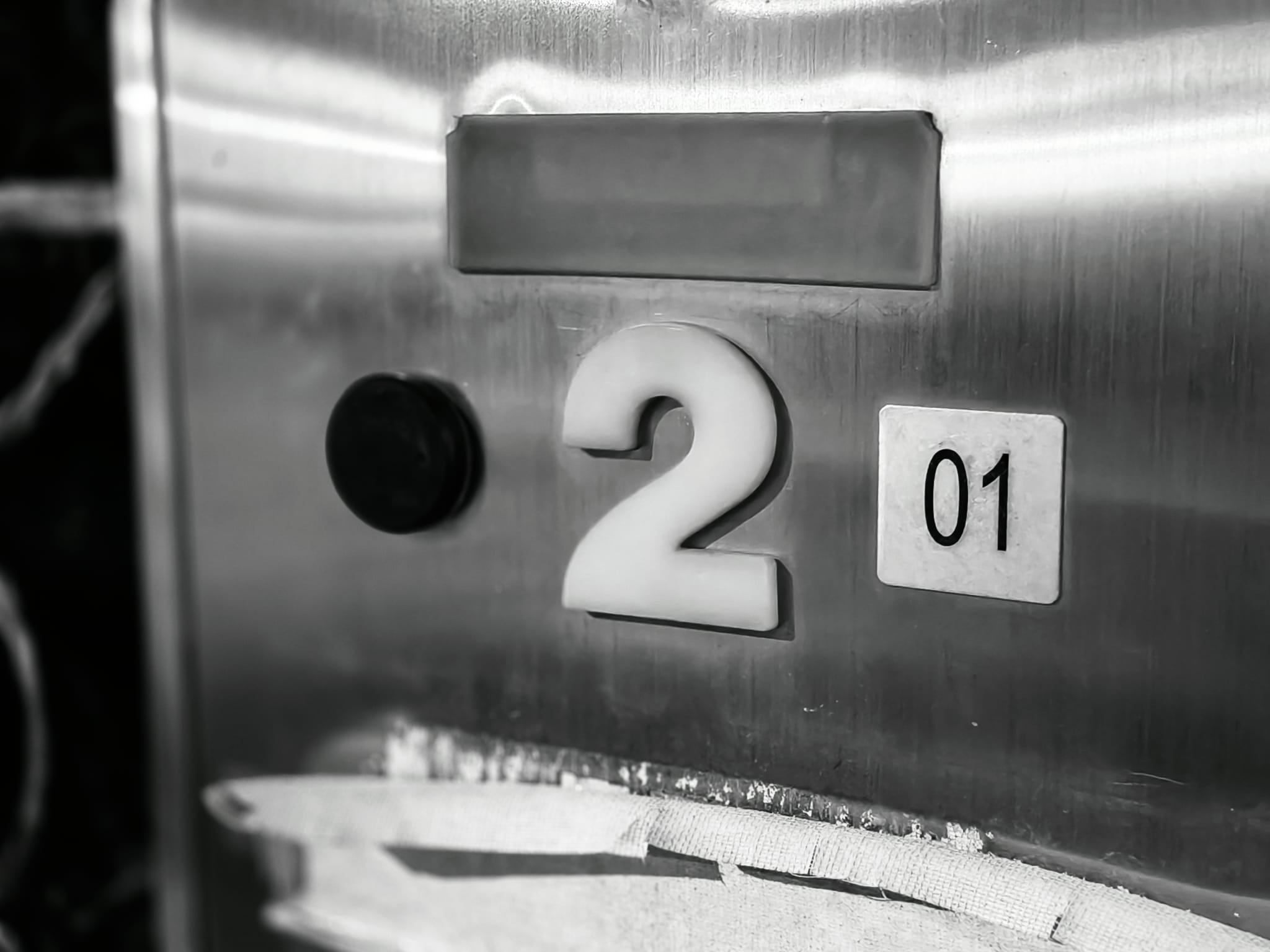
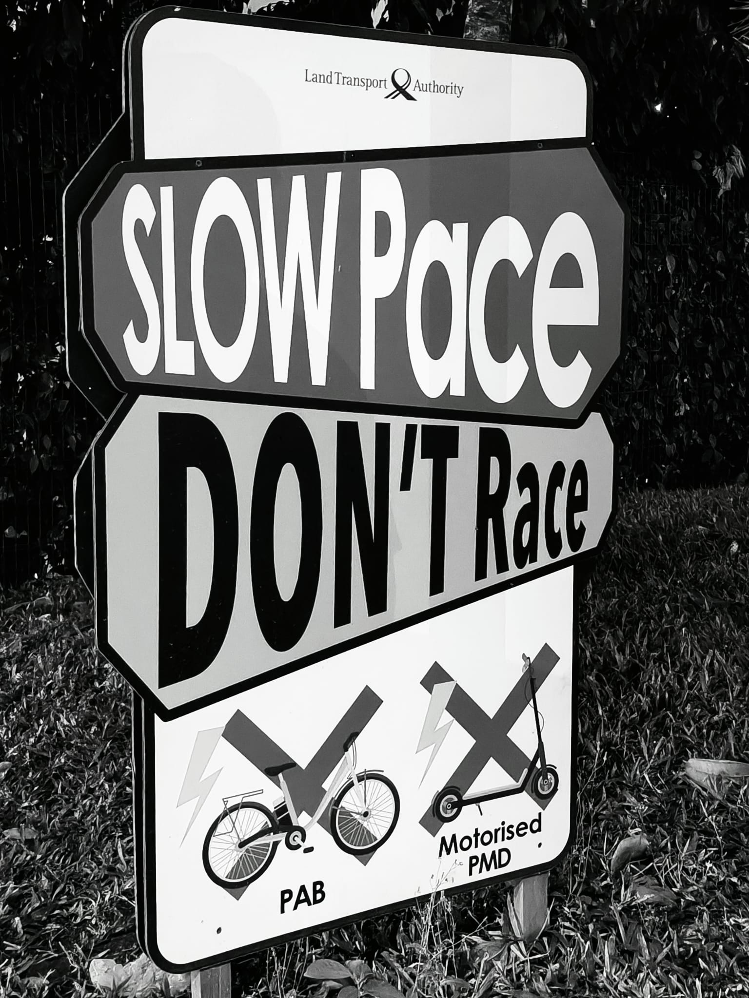
The first frame is a close look at a brushed steel panel with a bold “2.” It feels industrial and slightly worn, the kind of surface that tells you this area is used every day. Beside it, the “SLOW Pace, DON’T Race” board is a reminder that speed isn’t everything. The thick letters stack like building blocks, and in monochrome they read not just as words, but as strong shapes holding the scene together.
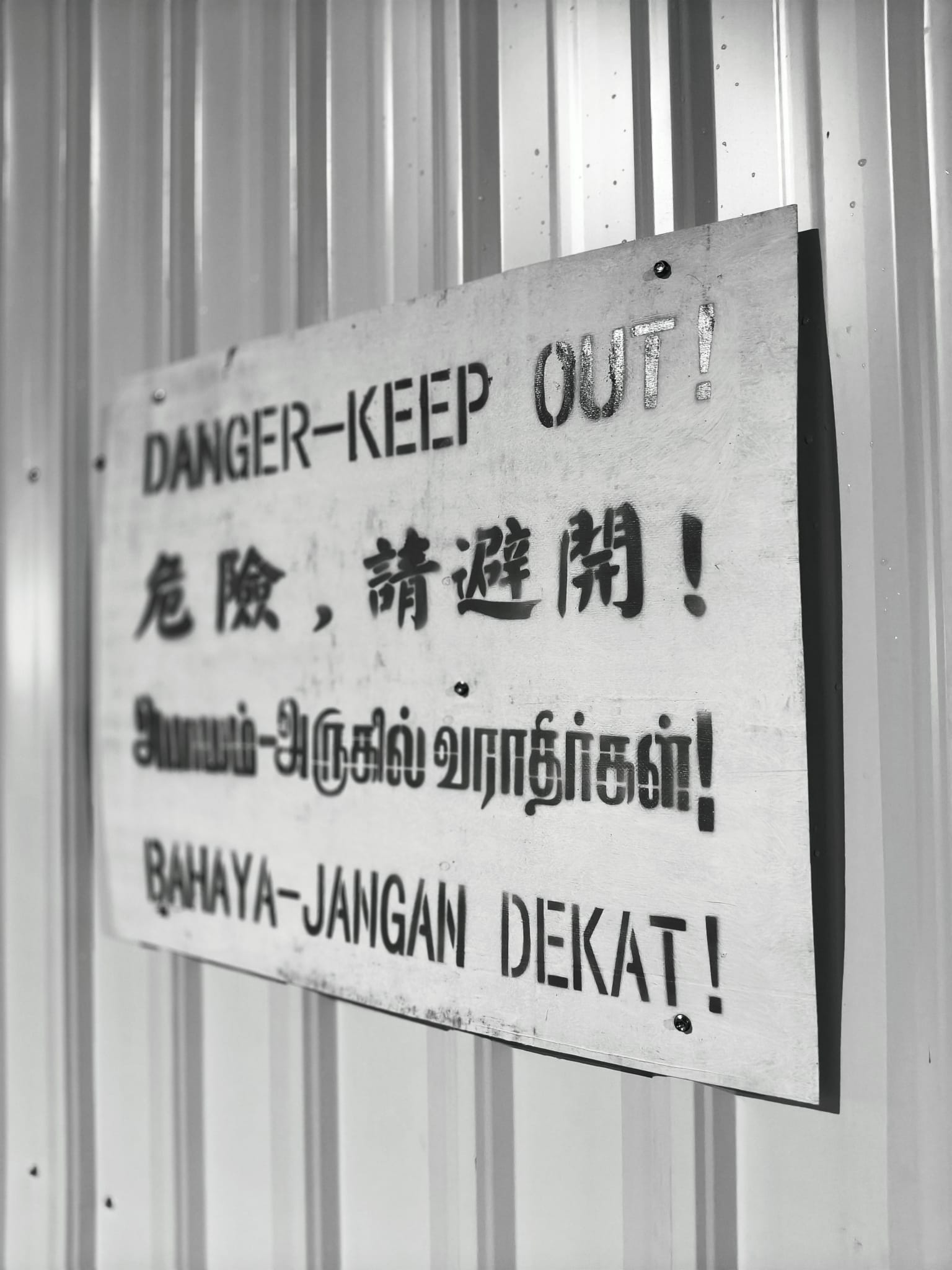
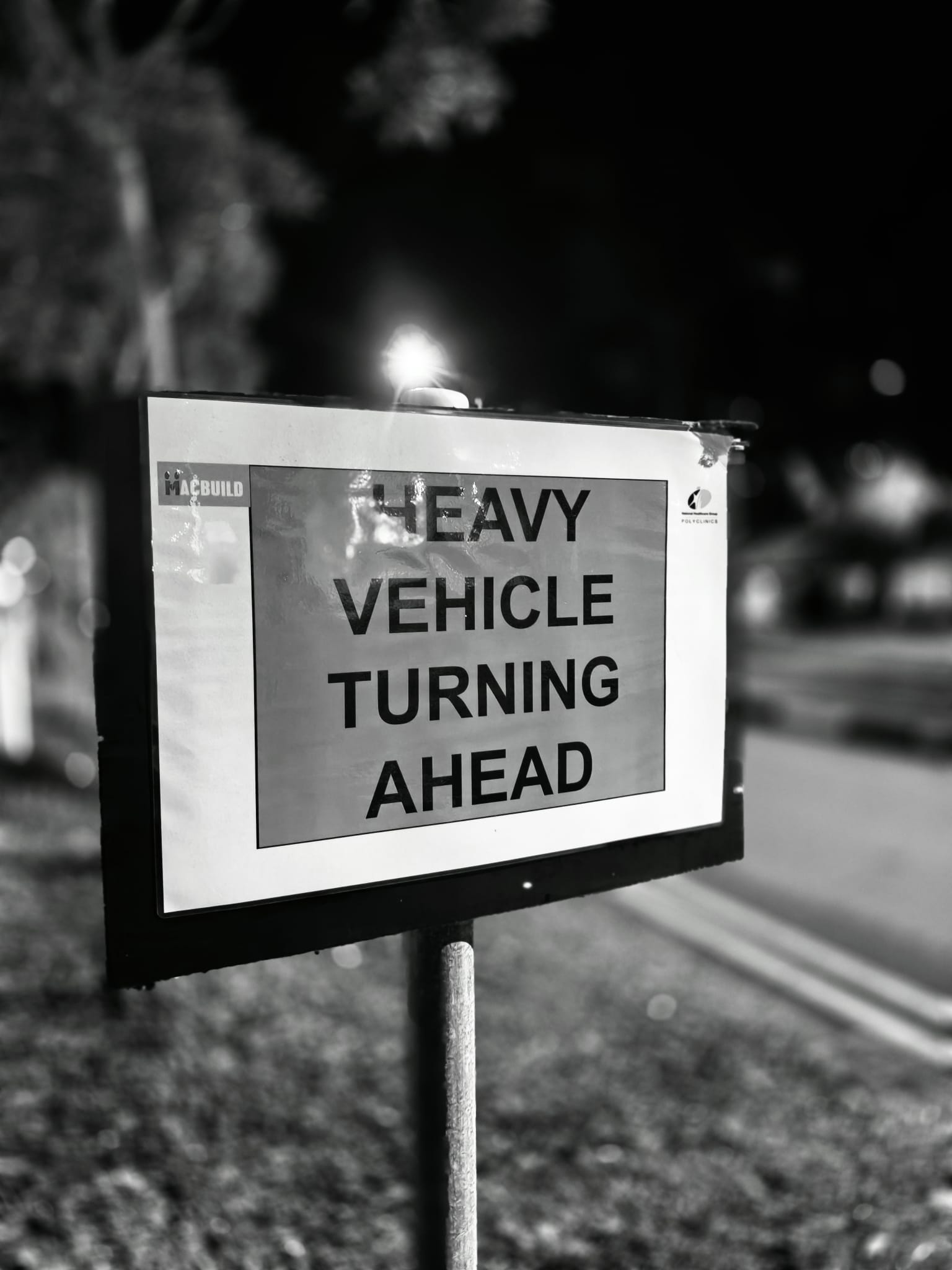
I was drawn, too, to the multilingual “DANGER, KEEP OUT!” notice fastened to a corrugated wall. The repeating ridges create a rhythm behind the message, while the different scripts remind me how cities speak many languages at once. Finally, a road-edge sign, “HEAVY VEHICLE TURNING AHEAD,” catches stray headlights and melts the background into soft bokeh. Night adds its own drama, the sign glows while the world around it fades to a hush.
These may be “unsightly” to some, but to me they feel like acts of kindness. Someone put them there to keep strangers safe. They stand guard in the rain and sun, get bumped, taped over, and replaced, yet their intent is steady. Converting them to black and white lets that intent shine through. I pushed the highlights and deepened the blacks just enough to make the edges crisp and the messages clear. In the end, the photos aren’t just about signs, they’re about care written in big letters for anyone passing by.
”To see in color is a delight for the eye, but to see in black and white is delight for the soul.”
~ Andri Cauldwell
Thank you for viewing my post.
Cheers!
@funtraveller
All original images by author