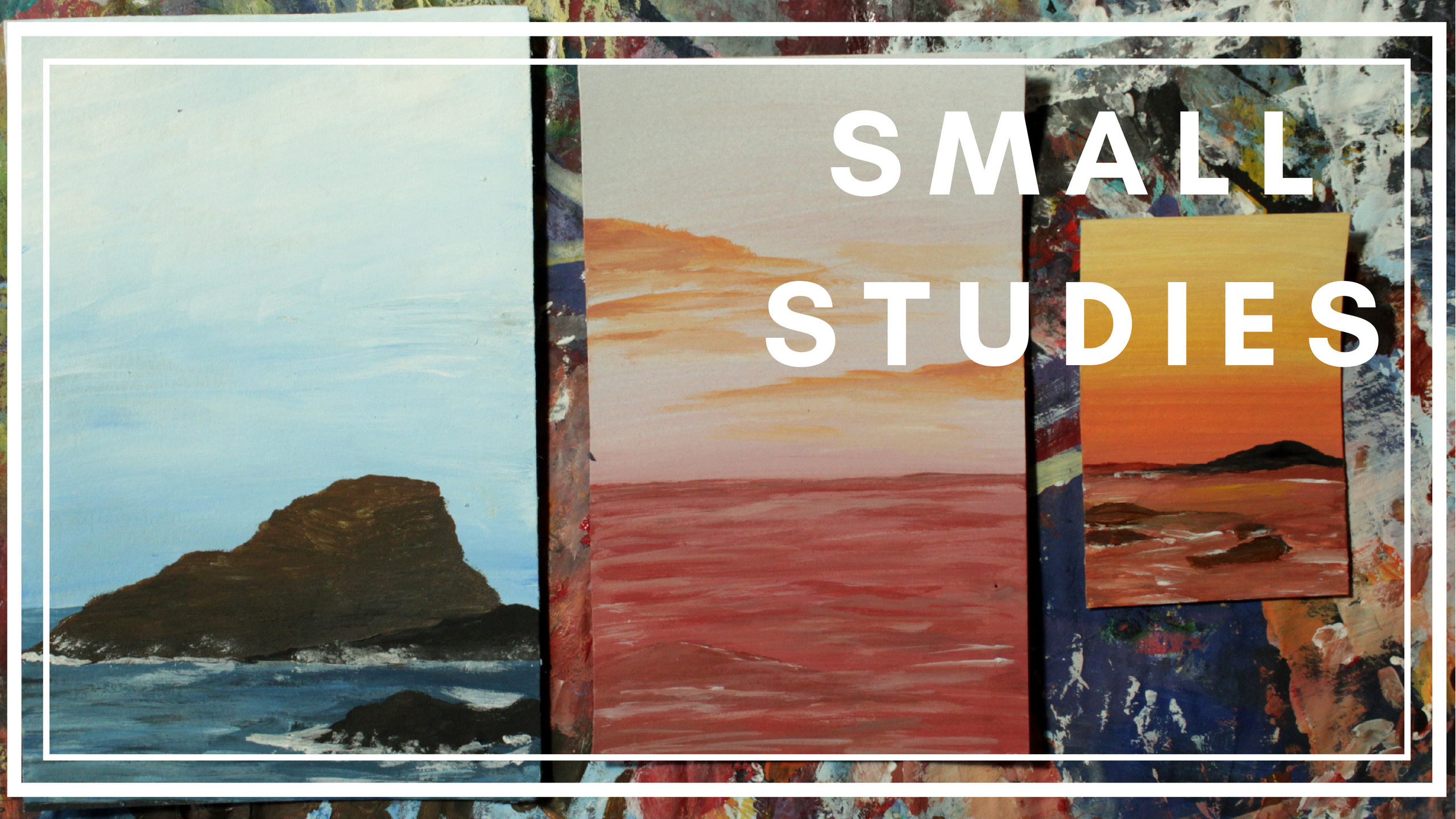
Hello, my dear community. About a month ago, I started a series of small paintings focused on the study of waves. Because of its dynamism, movement and values, I decided it was time to add a new rule to my composition. I had to listen to three different artists and let the brush think by itself, choosing the colors and mixing the values to reach a painting that was completely inspired by the music.
Mr Tambourine Man -Bob Dylan
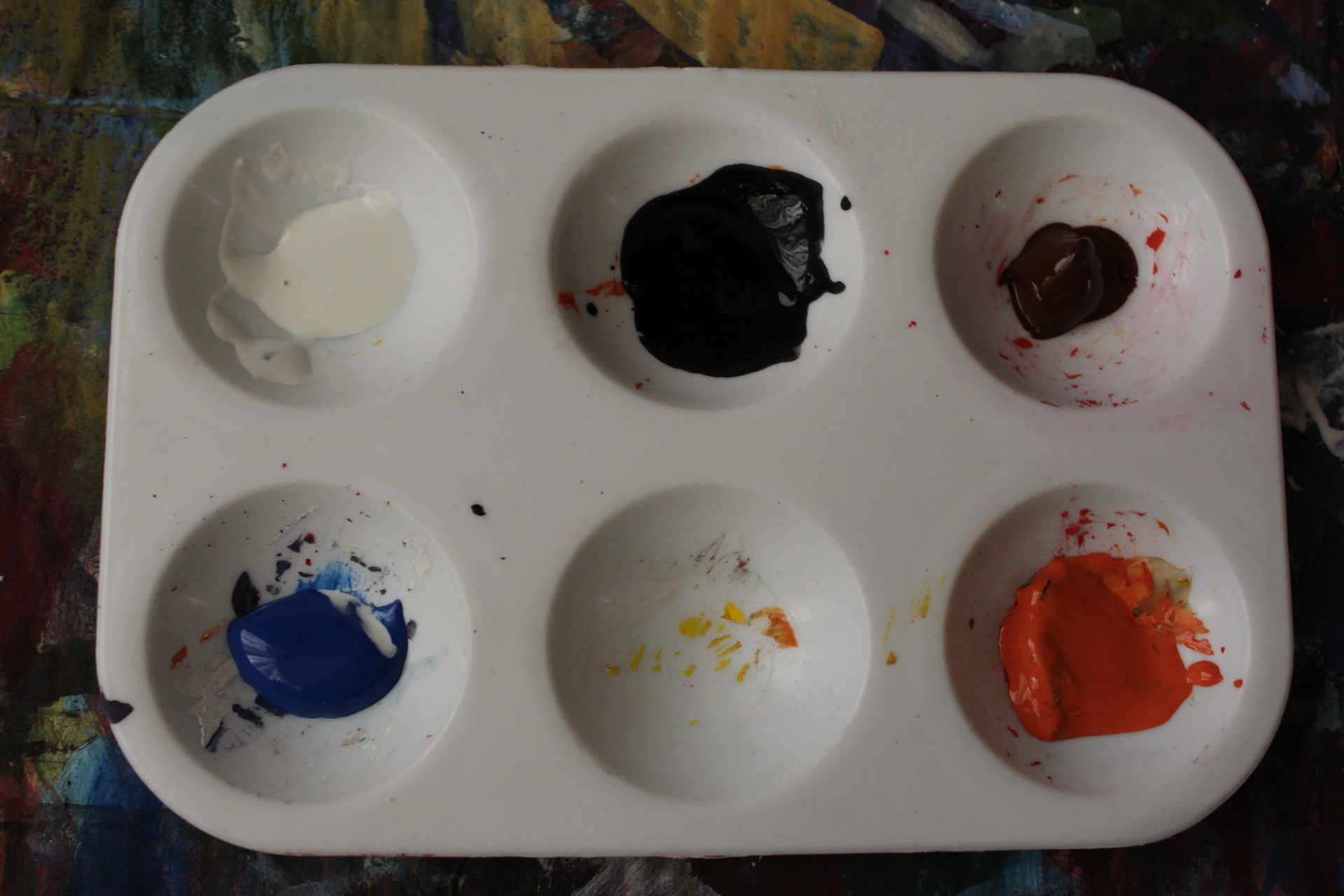
I started with a palette based on cold values, except for the orange, which I would use to create a bright tone on a rock I was sure I was going to paint

I got used to paint straight to the canvas, instead of making a sketch first. The main reason for this is because I enjoy when my imagination awakes by its own and all I do is to follow wherever my hand takes me.
https://www.youtube.com/watch?v=PYF8Y47qZQY
I started playing Bob Dylan's "Mr Tambourine Man" and this was the process of what came to my mind.
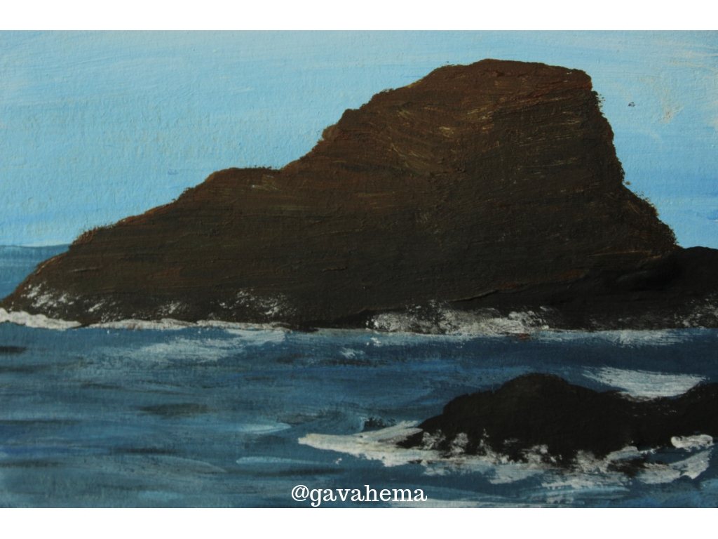
First, I created a blue, soft background. My idea was to paint on top of it, so I had to keep it simple. To paint the rock, I used three colors on acrylic paintings: brown, black and orange. I softed the brown with a little bit of white painting so I could play with the lights and shadows, and of course, I mixed the darkest tones to make the impression of depth and texture.
I continued adding some details, like another rock on the front of the painting, more shadows, more lines for texture, and then, I started to play with the dynamism of the waves.
This painting had a measure of 9cmx13,5cm.
.jpg)
Finished painting (detail)
Sign of the times -Harry Styles
https://www.youtube.com/watch?v=qN4ooNx77u0
The background was very simple to paint, I just made a mixture of red, orange and a little bit of white to make it softer, and when it dried, I started to make the details, starting from the center, then the bottom and finally the line edge of the sea. What I usually do is that I begin to paint the shadows to recreate the movement, and then, I paint the lighter parts and the foam with light touches of white diluted in water.
Finally, I mixed a little bit of orange and white, to create the value of warm, spongy clouds. I painted them from the sides to the center, and then added a little bit of detail to the shadows.
This painting had a measure of 7,5cmx12cm.
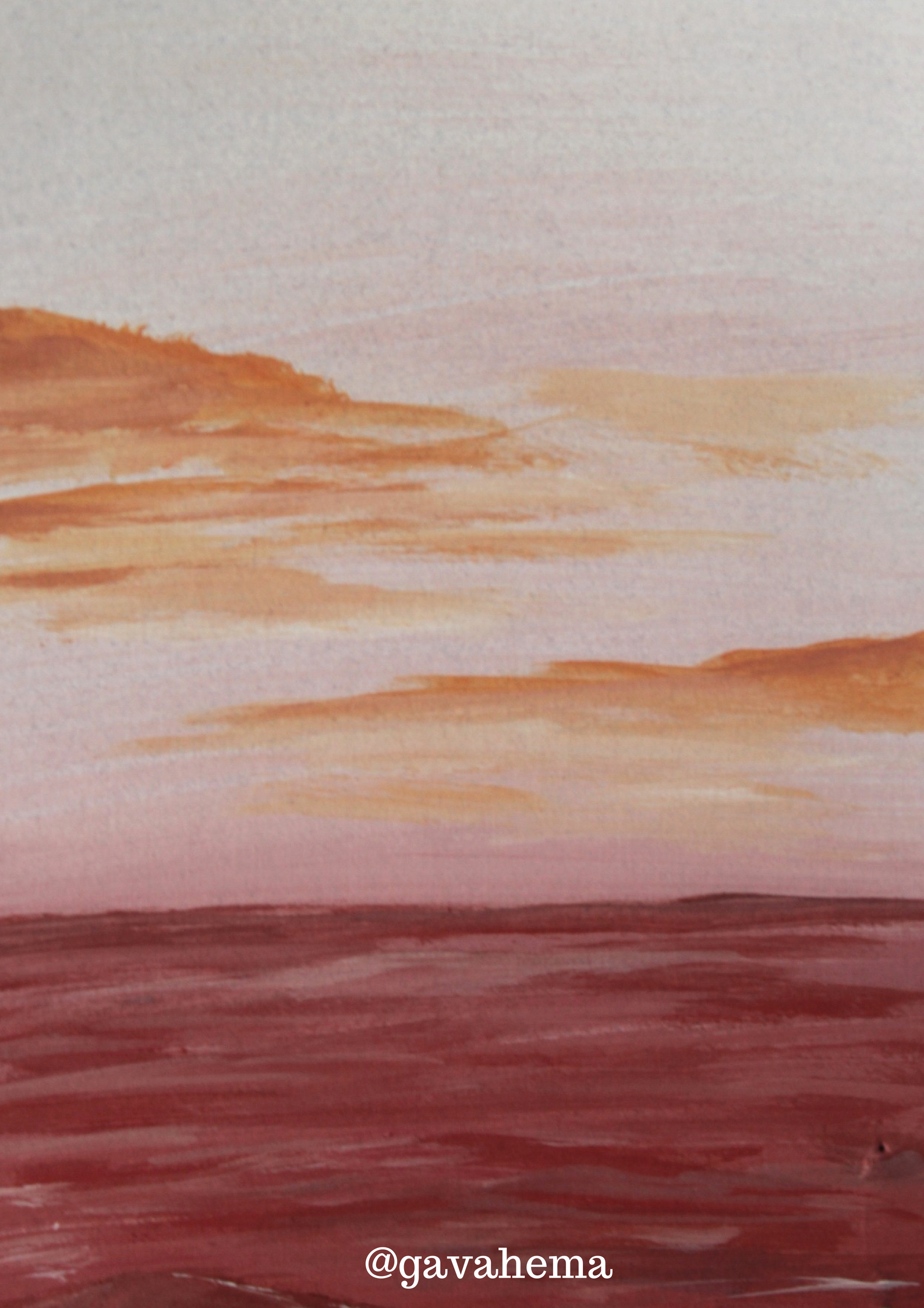
Finished artwork
Get Back -The Beatles
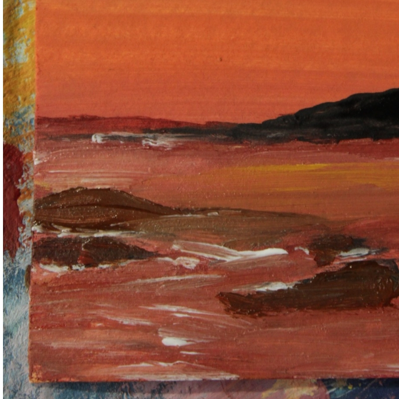
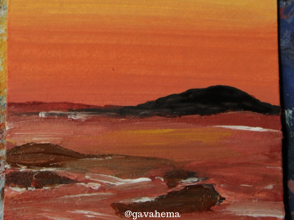
For some reason, this song in particular makes me feel aware of my freedom and my roots. I wanted to paint something that represented "joy" and for me, no other color is close enough to this feeling as yellow.
I started with a very light tone of yellow (which I mixed with a little bit of white) and then I blent it with darker tones of yellow until I reached a very intense orange.
Then, I started to concentrate mainly on the texture of the water.

https://www.youtube.com/watch?v=p6gKe9Fr2ok
.jpg)
I wanted it to feel like you're tired after a long day at the beach, and all the waves start to look the same. But, not because of this, they stop being beautiful, on the contrary, they keep a harmony, even when they crush with a rock, and the colors are nothing but a reflexion of the sky.
This painting in particular, was the smallest, with a measure of 4,5cmx6,5cm.
.jpg)
Finished artwork
Don't forget to give me an upvote and resteem!
