Ello, lovely ladies and gentlemen! Today, I'm sharing something I've been doing lately. This was inspired by LittleCoffeeFox's Vlog where I saw her doing this kind of gradient layering with watercolour. So I decided to try it out myself and wanted to share the technique with others here on SteemIt.
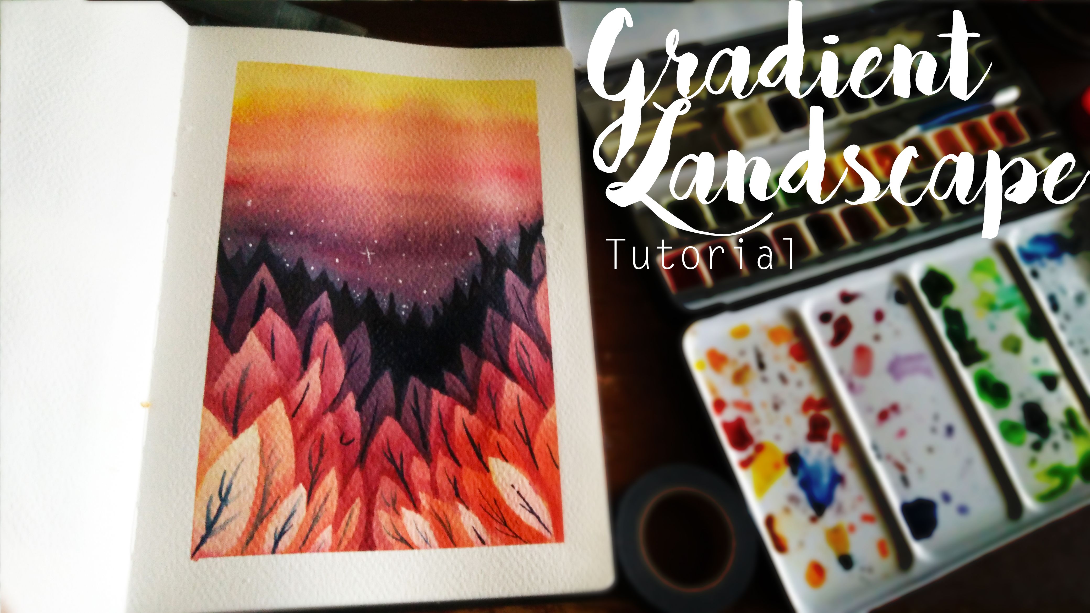So in this tutorial/demo thing, I'll be showing the application of using this stacking gradient technique in creating a graphic scene of a forest. All you need is some watercolours, your favourite point and flat brush, a good paper and a bit of patience.
So let's get started!
Step 1: Tape It and Wash It!
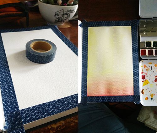This step is optional but I prefer to do this whenever I work in a smaller sketchbook. In this case, I'm working in my 200 gsm Monologue sketchbook. It's a little thinner than your average watercolour paper but it does the trick. The first thing I do is lay down some washi tape on the edges. The purpose is to create that clean cut white border.
The reason I used washi tape instead of masking tape is because washi tape is already pretty weak in its stickiness so I don't have to weaken it like masking tape. I tend to also find that weakened masking tape is not sticky enough to prevent the watercolour from seeping to the boarder.
Once I've set up my border, I lay down a very light wash of lemon yellow and a bit of rose madder at the bottom half of the page. These would be the lightest colour and be the very front of the gradient pattern.
Step 2: One Layer At A Time
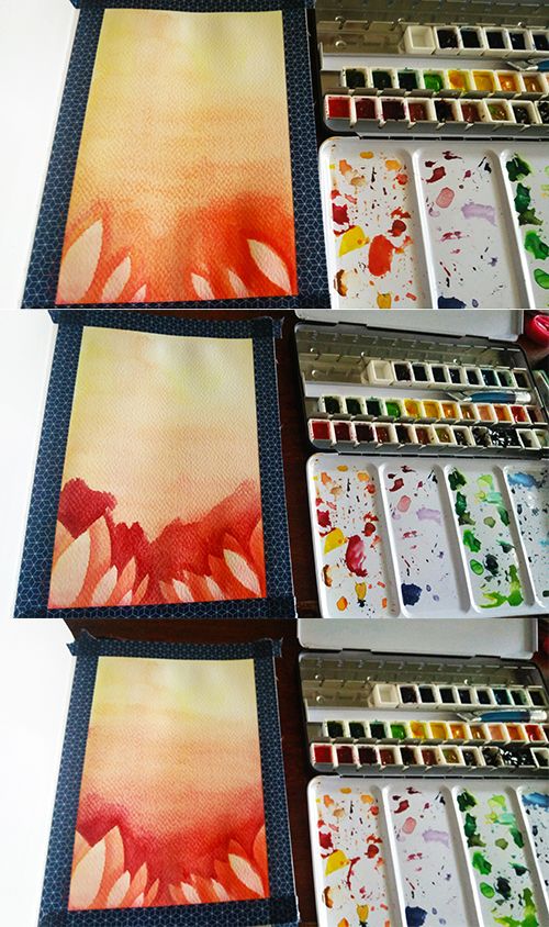And this is when you decide what kind of shape you wanna do for your gradient. In my case, I'm doing tapered ovals and I painted them with my round brush. I use that same mix of lemon yellow and rose madder but with a bit more rose madder to create that vivid orange.
As you go up on stacking your shapes, you go darker with your choice of colours. My first three layers of shapes is a mix of lemon yellow and rose madder and slowly adding more rose madder until I have a pure rose madder colour and have to transition to the next colour.
Once you've set down your shapes, grab your flat brush loaded with water and blur up that harsh colour upward. This serves two purposes: 1)Added a soft gradient to your shapes and 2)Creating the sunset sky background at the same time.
Now you could just stick with this kind of colour palette using the rainbow as your guide but I'll be adding a bit more contrast by...
Step 3: It's Only a Theory...A Colour Theory!
 Image SourceUnderstanding colour theory can really help in creating beautiful coloured drawings. One of the main problems I had when I started out in painting was being too overwhelmed with such a huge array of colours so the best thing to do is to limit the number of colours in a piece. This also helps in unifying the whole thing, making it pleasing to the eye.
For this drawing, I'm using this analogous colour palette and it's a common choice of colours when it comes to sunset shots.
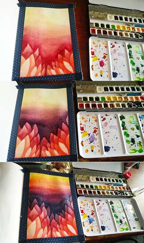So it's a simple rinse and repeat of stacking each colour of top of another until being satisfied. This is also a good chance to intensify the sunset to really make it pop. However, keep in mind that unless you have something like a heat gun or a hairdryer to speed up the drying process, each layer of watercolour is going to take a while to dry.
Step 4: Some Last Touches
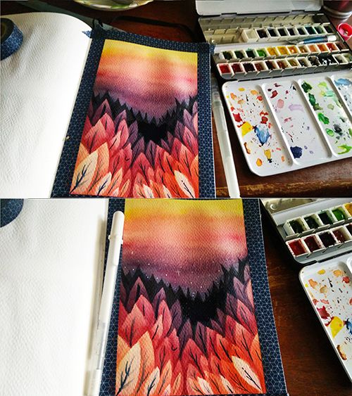Almost finished by adding some silhouettes of trees in the back and lining the branches of the trees with the same blue used in the gradient. Using something non-black helps in softening a drawing and making it not as stark as black.
And with a sky like that, adding some white stars gives additional visual info. A white gel pen is always handy in these kinds of things.
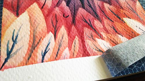All there's left is to peel back that tape and...
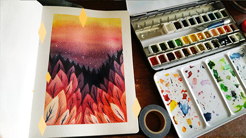Ta-da~! All done! I hope you guys have fun creating this.