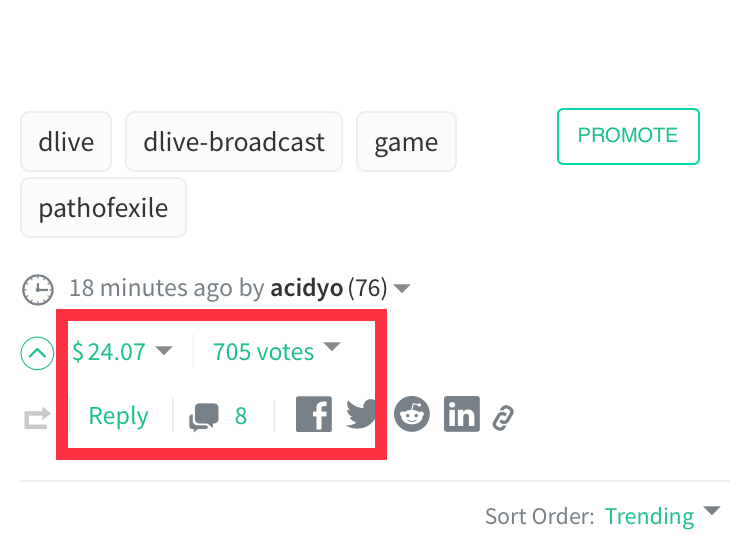
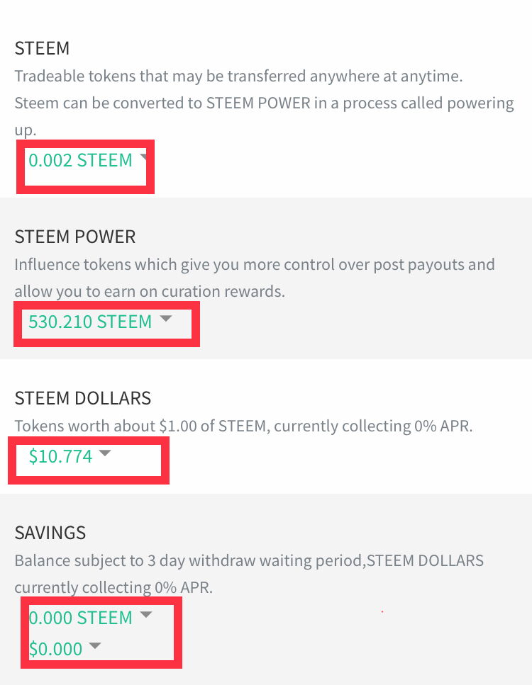
It all started when someone asked, “Hmmm.. i wonder how someone can ruin a perfectly fine steemit interface..???”
Steemit Condenser Dev Team : “Hold My Beer”
In all seriousness, the new interface of steemit looks like an Exorcism on Shrek that went bad.
Honestly.. it was already enough green. Why did they had to go and make it even more ... greeny..
Those who don’t know what i am talking about, behold the “greenish interface changes on steemit”..


Possible Reason For This Abominable Addition (My Version)
Apparently, the dev team wanted to make steemit look even more lit.. and they thought that “hey, lets colourise (read : make it green) the clickable / selectable options on steemit. That way, the dumb people can finally understand that there are certain options that invoke further actions when clicked..”
Conclusion
It was totally unnecessary and actually looks poor. Its like Jony Ive trying to impress people with the “new iphone” that basically looks like the previous model(s) but this time in green colour. (Hurray?)
These little iterations in interface will not yield any appreciation. Please revert this and don’t even think about changing steemit condenser unless it looks like the main menu of Tron Legacy.
What do you think of this (greeny) addition? Let me know in the comments section.
JBN