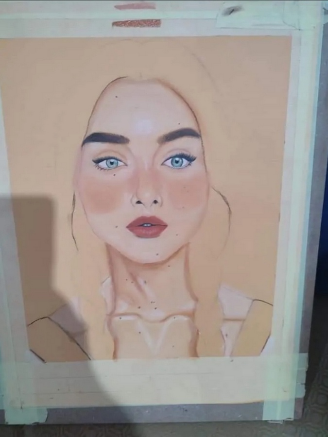
As_creatives, we don’t just stick to a color palette with a certain fixed saturation and hue level. We appreciate colors that are less saturated and muted at times too. Whether it’s in clothes, decorations, or structures, we feel that highly saturated colors can sometimes take too much away from the natural beauty of its raw colors.
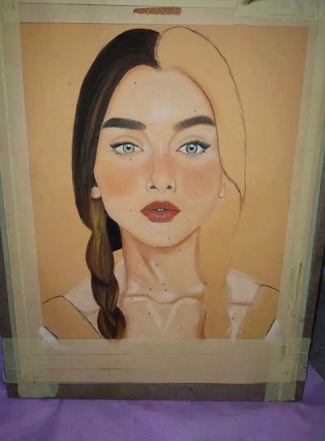
I posted it before on another community and I liked to post it in this community too.
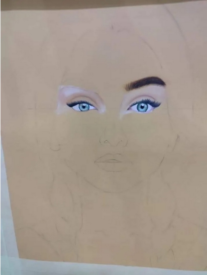
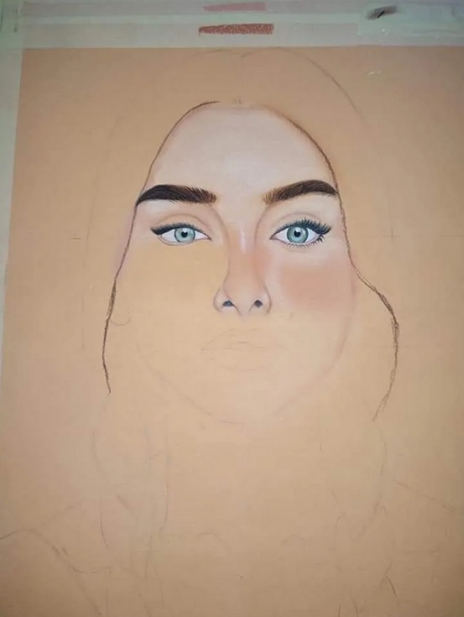
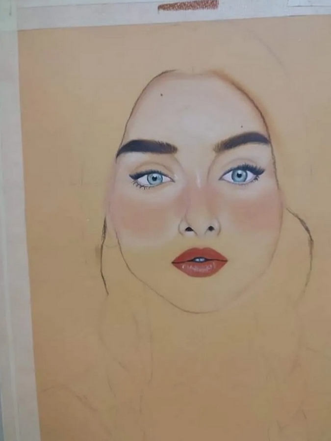
My experience with these colors was in 2019، I had a hard time drawing this new way at first. But after training so hard, I have become so good.
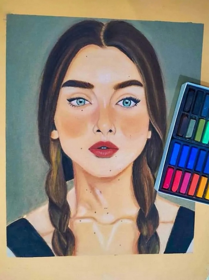
So, Here are the steps, I hope you like it. ❤️