Anders Zorn was a great Swedish artist.
But when you're (like me) starting your journey in art, the one thing he's most famous for is his limited color palette.
You see, through out his career he painted portraits and figures using only four colors: Titanium White, Yellow Ochre, Vermilion Red and Ivory Black. Where black serves as a primary blue, and white is used to cool down colors.
But how is it possible to achieve all the hues necessary for painting portraits and figures?
Well, the thing about colors is that the hue and temperature are relative. They change based on what colors are placed next to each other...
Which means, you can get something that looks like a vibrant violet by mixing black, white and red... and place it next to Yellow Ochre. Or, you can get a pretty deep green by mixing black, yellow ochre and a little white. And place it next to red. And so on...
Anyway, Zorn palette is a great tool for learning to paint. Because you don't get bogged down by the million choices you have when you use a full palette.
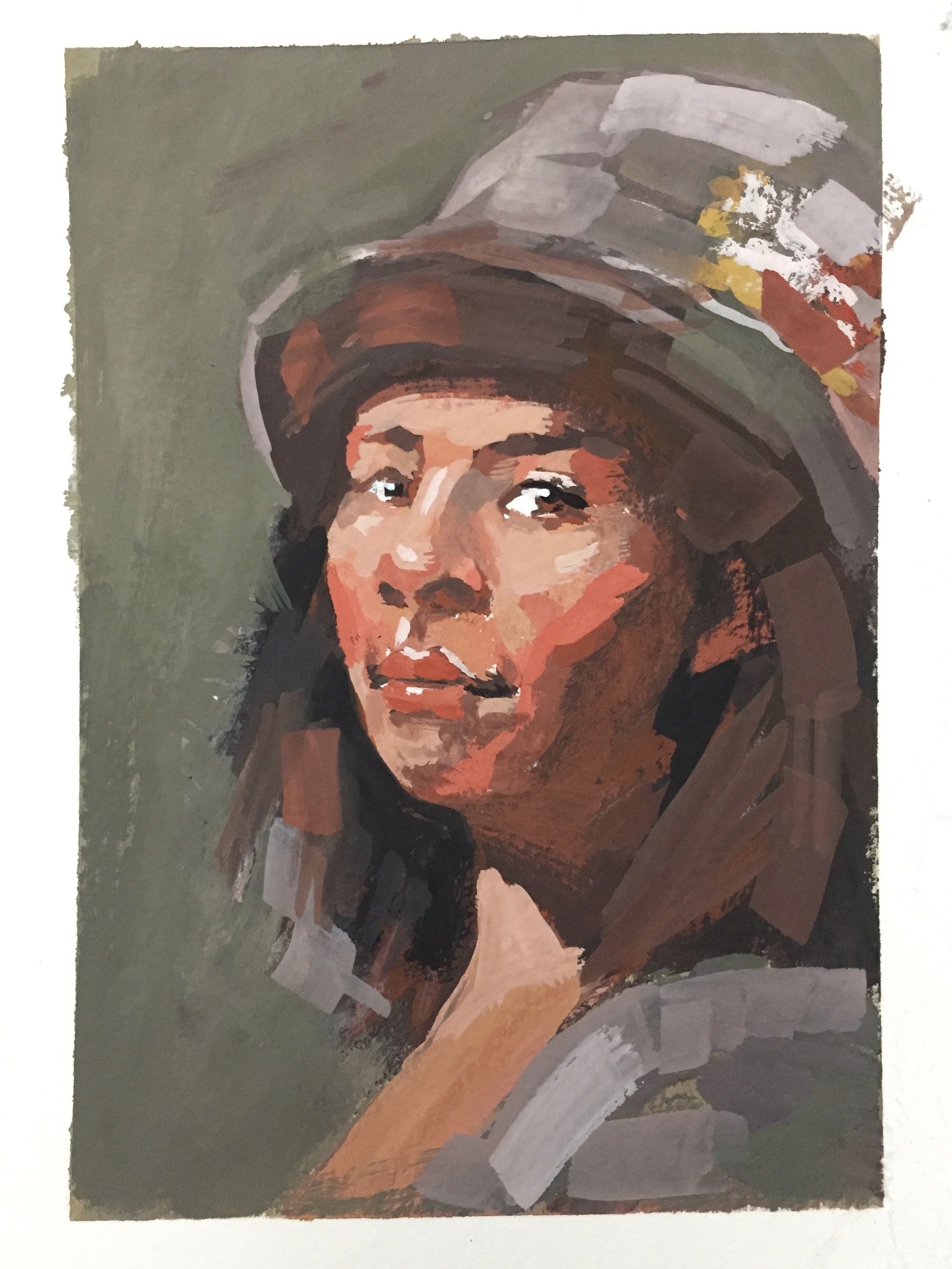
Here's my portrait gesture study in gouache, using the Zorn palette. (Winsor & Newton Lamp Black, Cadmium Red Medium, Titanium White, Yellow Ochre.)