Hi hivers,
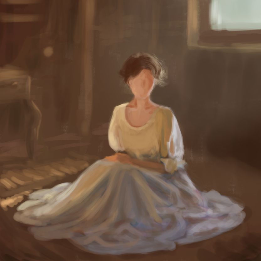
This is my new sketch. I used a human as a reference, which immediately made the task significantly more difficult for me. My ability to draw people is still quite undeveloped — I've been watching and re-watching anatomy lectures, doing sketches, constructing forms, calculating proportions, analyzing — but it’s still really challenging. The difficulty lies in the fact that, despite the diversity of human forms, we instinctively detect any discrepancies because, psychologically, humans are the most important objects in our perception — they can pose a potential threat. Because of this, our gaze tends to focus on the face (to interpret emotion) and the hands (to assess readiness for action). So the face and hands should convey this in a drawing (and I haven't even tried to address this in the sketch yet). That’s why I decided not to include the face in order to stay within the time limits I set for this sketch.
What's most interesting here? The transparency of the fabric and its reflective properties. It mostly reads as silk or satin. Transparency appears only under strong directional light, revealing skin tones in some places. It’s quite a sturdy fabric, but it catches the light beautifully. There’s also backlighting, which comes from behind, leaving the whole figure in shadow except for the contours and cool-toned reflections.
And finally, the “drapery” — how the folds of fabric settle. Here I simply replicated what I saw in the reference, mentally analyzing areas of tension versus free fall. This is a classic exercise for art school students, and I’ve wanted to train with it for a while. But I can already tell I’ll be revisiting this topic again.
Thanks for reading, have a wonderful day :)
Привіт,
Це мій новий скетч. Тут я взяла за реф людину, що зразу стає для мене на порядок складнішим завданням. У мене людина ще дуже погано відпрацьована, я дивлюсь і передивляюсь лекції з анатомії, я роблю начерки, побудову, прораховую, аналізую, але це все ще дуже складно. В першу чергу малювати людину складно, бо незважаючи на різноманітність людей, ми легко зчитуємо невідповідність, бо психологічно людина для нас найважливіший об’єкт, який може нести загрозу. Саме через можливу загрозу погляд буде зупинятись на обличчі (для розпізнання настрою) і на долонях (для розпізнання готовності до дії). Тож обличчя і долоні мають це передавати в малюнку (і я навіть не намагалась поки зайнятись цим у скетчі). Тож я виключила малювання обличчя, щоб не виходити за часові рамки на цей скетч.
Що тут найцікавіше? Прозорість тканини і її властивості відображення. Більш-менш тут читається шовк чи атлас. Прозорість тільки на дуже спрямованому світлі і де-інде тони шкіри. Це досить міцна тканина, але й блищить вона непогано. І контрсвітло, яке йде зі спини і тому вся фігура в тіні, окрім контурів і холодних рефлексів. Ну і “драпіровка”. Те, як лягають складки тканини. Тут я просто повторювала те, що бачила на референсі, прокручуючи в голові аналіз місць натяжіння чи вільного падіння. Це класична вправа для студентів творчих вишів, тож мені також давно хотілось потренувати. Але я і бачу, що ще буду повертатись до цієї теми.
Дякую за увагу, гарного дня :)