Here is my entry for the weekly Splinterlands Art contest found HERE
Normally, I peruse the Splintercards site each week for some ideas on which character to draw. I usually scroll through the Cards, sometimes type in a keyword like "fire" if I feel like using a hot palette. For the first time I noticed this little tab on the website (full disclosure: I don't play Splinterlands)...
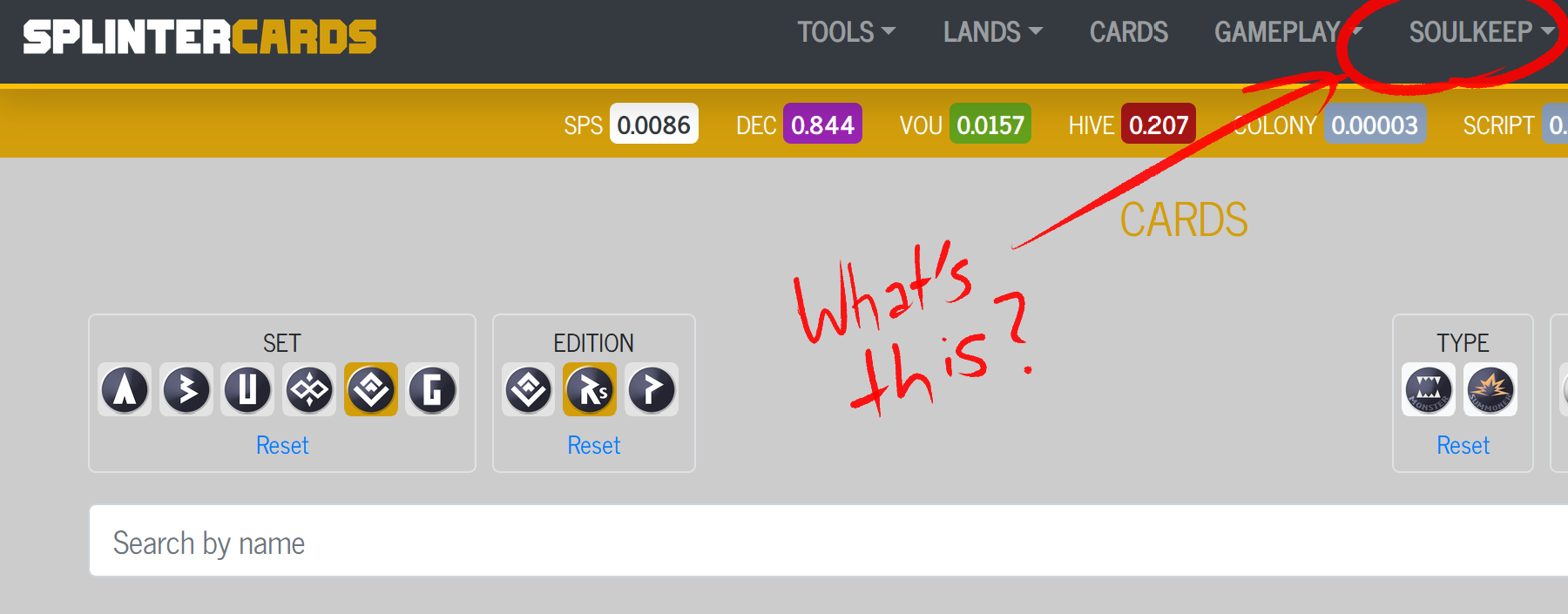
And so I discovered a whole page of these fiendish critters:

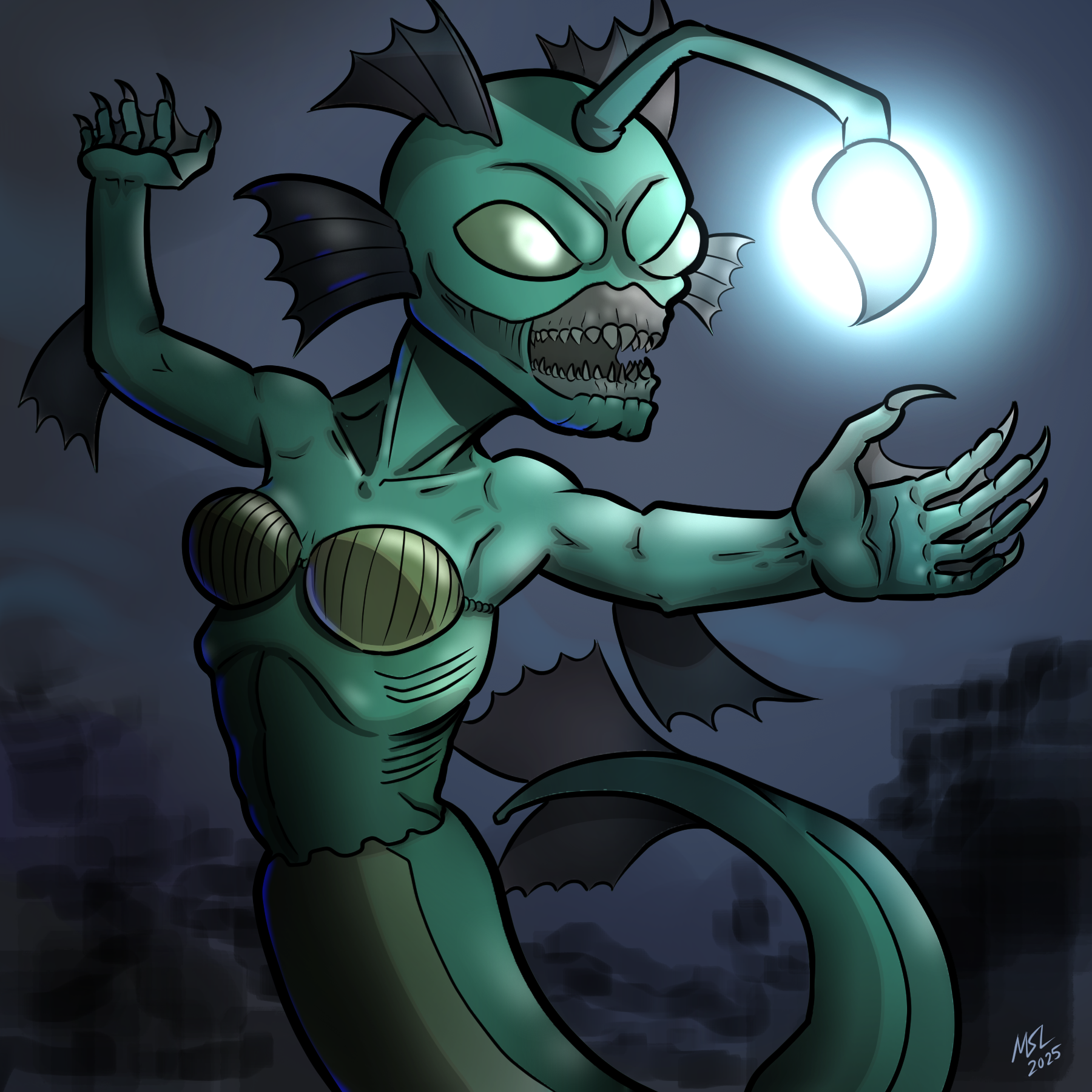
So scrolling through the game sprite images I spotted the Siren and Siren Queen. Instead of the sexy, mermaids that call sailors to a drowning death with their songs, these sirens are horrid angler fish-looking sea skanks. Perfect, I can draw that.

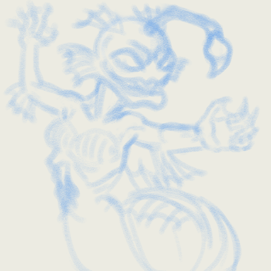
First, as always, start with a rough draft. I use a 40px Pastel brush to chalk in an outline. Normally I would refine the image with a mechanical pencil, but this is a monster. If the proportions are off or disfigured that just makes it more monstrous.
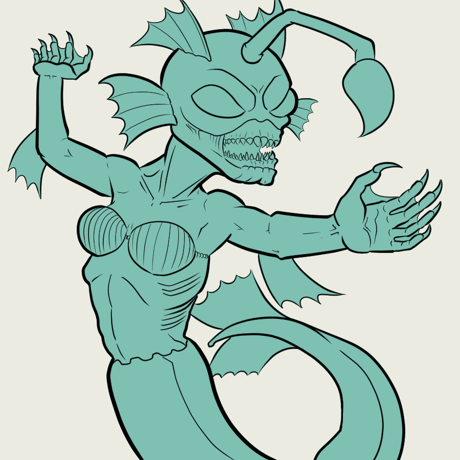
So I just leapt immediately into step 2, line art. I've been experimenting with lighter line arts to try to get away from the more comic-booky look and more like a finished painted piece. But screw it. It never looks right, so instead I went the opposite way. The bulk of the line art is a 20px G-Pen brush for nice, thick solid lines, like you would see in an Archie comic from the 80's. I draw comics, I'm going to own it.

Then I ditch the rough layer and fill the entire silhouette with a flat layer. Going with a nice sea-foam green, like the kind of color that ladies choose for their bridesmaid's dresses, so that they don't look as nice as the bride.
A new layer, clipped to the flat layer, for other colors. This image looks pretty subdued, but that's only because I changed the saturation on this layer later. I started off with some pretty bright purples and orange hues, but changed them towards the end. That's why you should watch the process video at the beginning.
Next I made a layer for some cell-shading-type hard shadows, cast off of that beacon attached to her forehead. Also made a faint pink outline on the cell shadow layer. You probably wouldn't even notice that if I didn't pint it out. Adding a faint red-tone is always a good idea to show that something is living and has blood under its skin layer.

She's not looking quite dark enough so I just used a very large air brush tool to make giant swaths of shading on her side opposite the light. Again, this is something I did later, because it didn't look like she was dark enough being underwater and her own head lamp being the main if only light source.

The background layer I actually did last, but I wanted to throw it in here so that when I show the glow layer it really pops. Background was just filled with a dark blue, there are a few large swipes of dark greens and black just to show so water currents. And used a black cube brush to make some vague rock or coral shapes along the bottom.

Did a lot of messing around with some color multiply layers to try to get the tone right. The bright colors I originally had did not look quite fiendish enough. Here's the same image just with a couple of multiply layers of new colors thrown on. Fun fact, the deeper you go underwater, the colors on the end of the spectrum are the first to disappear from the visible light spectrum. So you would stop seeing violet first before any other colors disappear. Cool, right?

Last thing. One last layer on top of all the rest so that we can make her angler-fish-lure-thingy really bright. That is sure to attract unwitting sailors off of their boats. Boom!
And of course, sign the bottom. On the glow layer so that my initials really pop. Sure, it may be distracting, but that little distraction may just save a sailor from being consumed by the Siren Queen. Popeye, you are welcome.

Also, I'm trying out using 3Speak again for hosting the process drawing video. It's not quite as convenient, since I can't upload images directly from 3Speak. So, instead, I just load the video, wait for their servers to process it, then come back to HIVE and edit it. And apparently editing a video on Hive.blog does not allow you to use the side-by-side editor that I use when you are creating a new post. So, there's a lot more up-down scrolling involved in this. Oh well, thanks for reading, scrolling, and possibly watching that video. This has hopefully been a fun and informative, multi-media presentation for your viewing, listening and reading pleasure.
And what's with the center justification on everything?
Sure thing! Here’s a professional disclaimer you could add under your artwork post:
“This artwork was created entirely by hand using traditional and digital techniques. No AI tools, generators, or automated processes were used in the creation, design, or completion of this piece.”
▶️ 3Speak