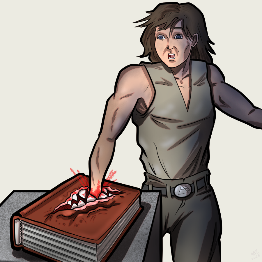
I have played D&D since 1st edition. I have owned a Sword of Wounding. I had a Living City character that dual-wielded two Daggers of Wounding.
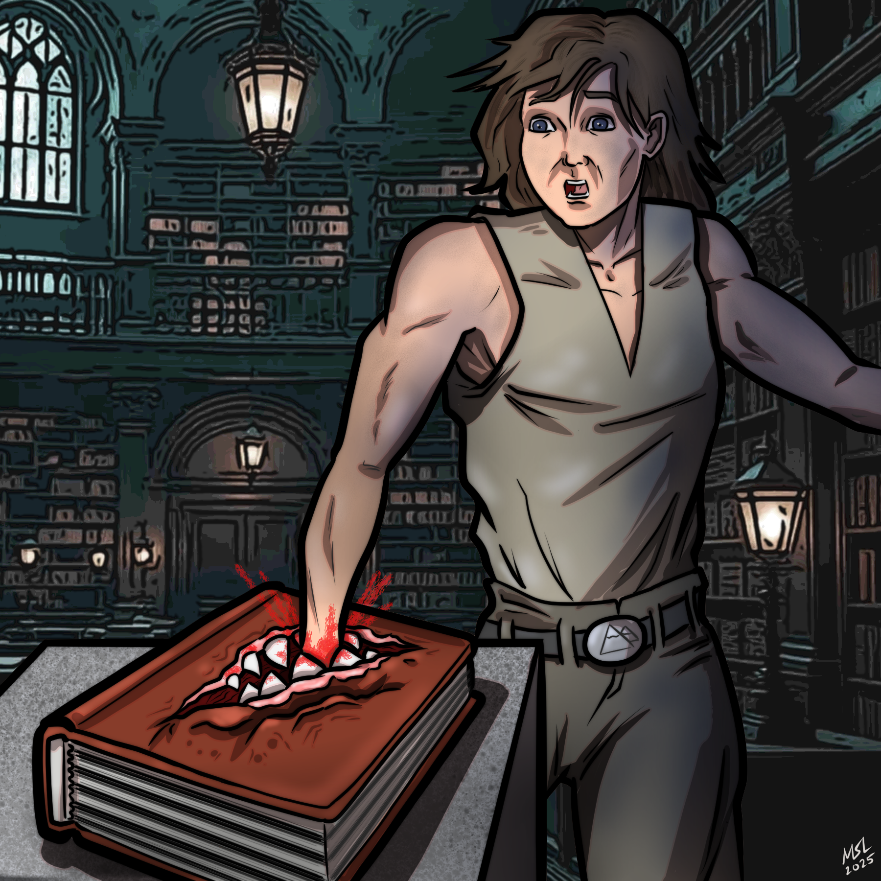
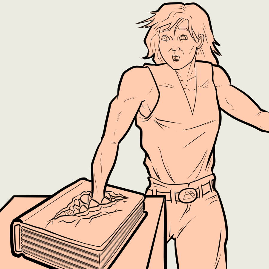
But I ain't never seen a Book of Wounding.
This here is my entry for the weekly Splinterlands Art contest found AT THIS LOCATION IN CYBERSPACE RIGHT HERE.
Created using Clip Studio Paint Pro on my portable art studio which consists of a Microsoft Surface Pro 7+. Here is the time lapse video:
https://youtube.com/shorts/KevxJw5qzvs?feature=share
Want to learn how to draw this. Just do what I did there in the video. Done. Oh, okay, fine, let me break it down for you...
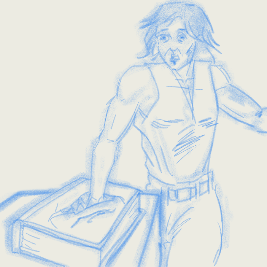
Step 1: Rough draft. I use a 40px Pastel brush to lay down a quick shape, then a 20px Mechanical Pencil brush to refine the image a bit. That looks like this:
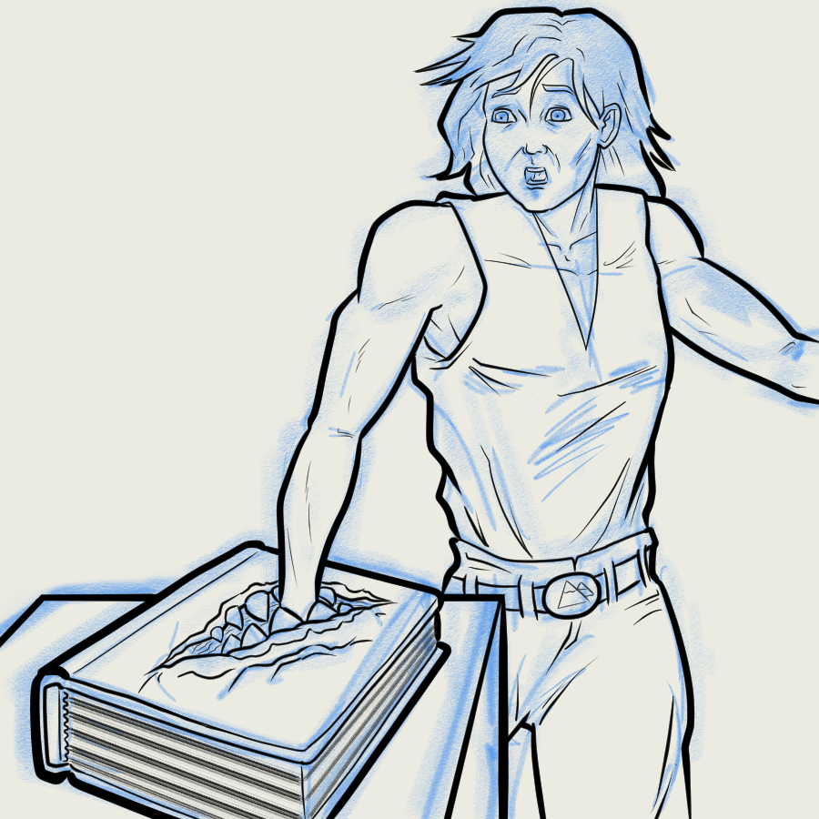
Step 2: Line art. I've been leaning into using heavier line art lately instead of trying to make more realistic painted images with thin lines or no pen outlines at all. No more. This is easier. To heck with realistic rendering. If I wanted a realistic image I would take a photo... ...of a guy getting his hand bitten off by a big book. Nevermind. I used a 20px G-Pen brush for the main outline of the figure and from 8px to 12px for the interior lines. Actually, I think I may have gone 25px for the altar and book in the foreground. Go bold, or go home!
Step 3: Flat layer. I used the magic wand tool to select the entire area that is NOT my figure. Namely, these 5 red X's:
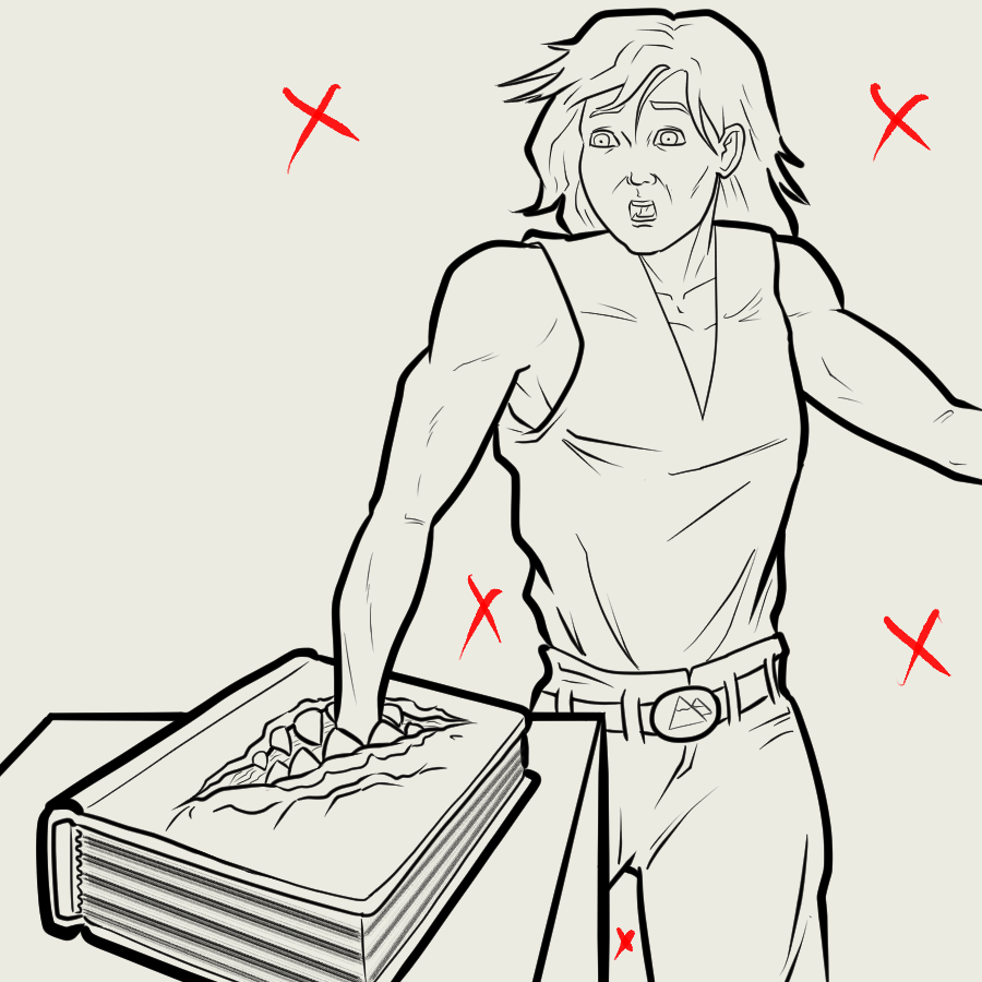
I then inverted the selected area and used the Paint Can Fill Tool to fill the entire area that is NOT NOT my figure. See?
Step 4: Basic colors.I just use the Paint Can fill tool to add in the different colored sections. I just noticed that there are actually some textures drawn in on this color layer. If I was paying attention I would have done those on a separate layer. Instead, you get a preview of the stone and skin texture using some specialized brush tools. Texture Organic brush and Texture Spray brush.
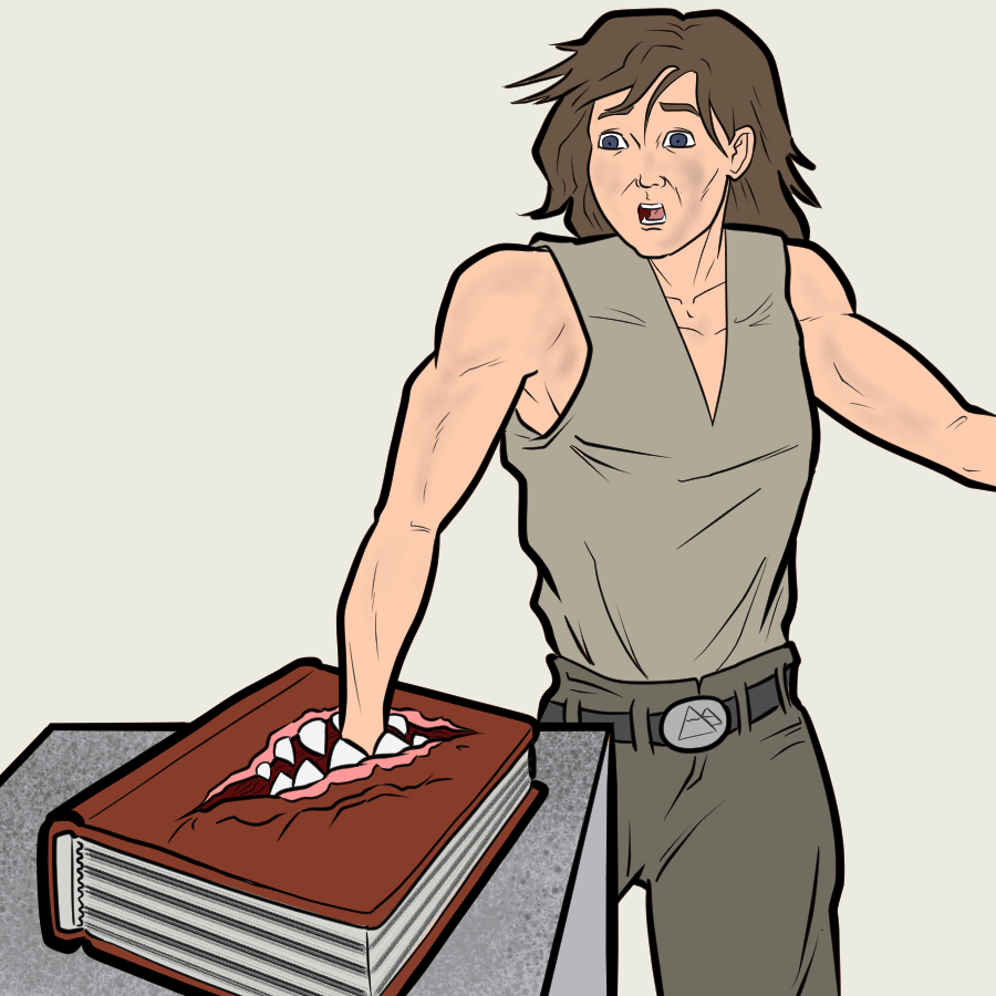
Step 5: Rough shadows. I used the Shading Assist feature in Clip Studio to throw down a big shadow on the "Flat layer." I had to rearrange the layers later so that the shadow also falls on the Color layer. I went back into this layer later and airbrushed in some dark blue shadows to make the library look darker.
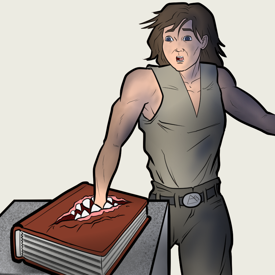
Step 6: Cell shading layer. This is something I started doing in my Kickman comic. Using a basic "big shadow" layer and combining it with a cell shading layer for better control. I'm not great at cell-shading and probably should have done a little less of it on this image, but.... too late! The cell shade layer is just another multiply layer that also has a slight pink outline.
Step 7: Created an Overlay layer for some highlights and reflected light. Also created a "detail" layer, that I think only has the pin points of reflected light in his eyes. Then finally a "Blood" layer. Played with a few different brushes trying to get the right look for that blood spray. Settled on the Pointillism Brush. I don't know what kind of real world brush that is supposed to replicate, but I think it works fine for a blood spray. Also to smear some blood on the teeth and gums.
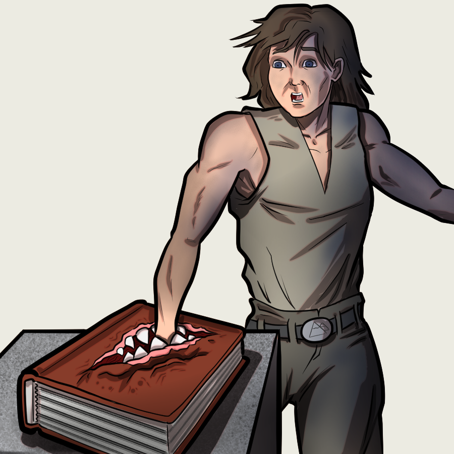
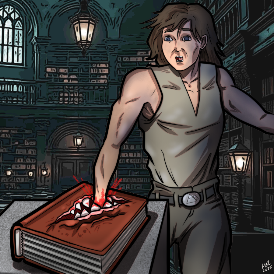
Step 8: Background. I used NightCafe AI generator to create an image of a "haunted library." Because that's the kind of place where you are likely to get bit by a carnivorous book. I zoomed into the section of the image that looked right, then ran it through an artistic effect to create fat lines and reduce the amount of color blending, to make it look more like my "fat pen art." Then reduced the saturation to dull the colors and then lightened it a bit. This is actually one of the few instances where the background actually looks similar to my art. I've got to remember how I did this later...
Also, signed my initials in the bottom corner.
Step 9: Fame! Fortune!
Thanks for reading. And remember, kids: Books kill!