### ***Una vez más estamos probando el estilo bicolor-sketch, el cual es un boceto o dibujo que utiliza únicamente dos colores, estos bocetos pueden incluir patrones abstractos con formas geométricas y líneas o pueden ser ilustraciones más tradicionales.***
***En [mi post anterior](https://peakd.com/hive-174301/@ushiro.snow/two-color-sketch-red-and) exploramos el color rojo y azul y para este nuevo proyecto voy a realizar un boceto con los colores rosa y morado claro para ver como interactúan estos dos colores.***
***Estos bocetos son una forma de arte que puede ser más simple y que enfatiza el contraste y la composición a través del uso limitado del color***
[Ejemplo de bicolor-sketch](https://www.pinterest.com/pin/398920479516060123/)

Esta técnica se caracteriza por ser mayormente bocetos, lo cual nos da libertad de hacer trazos y lo que nos deja con un diseño imperfecto, pero justamente eso es lo que lo hace perfecto por la unión de dos colores y colocarlos en lugares específicos, podremos crear calidez o frialdad de color.
Los colores más comunes es el azul y el rojo, pero esta vez usaremos rosa y morado, esos dos colores serán útiles para realizar un boceto sencillo y empezar esta exploración y trataré de ser fiel a esta técnica evitando un poco lo estético.
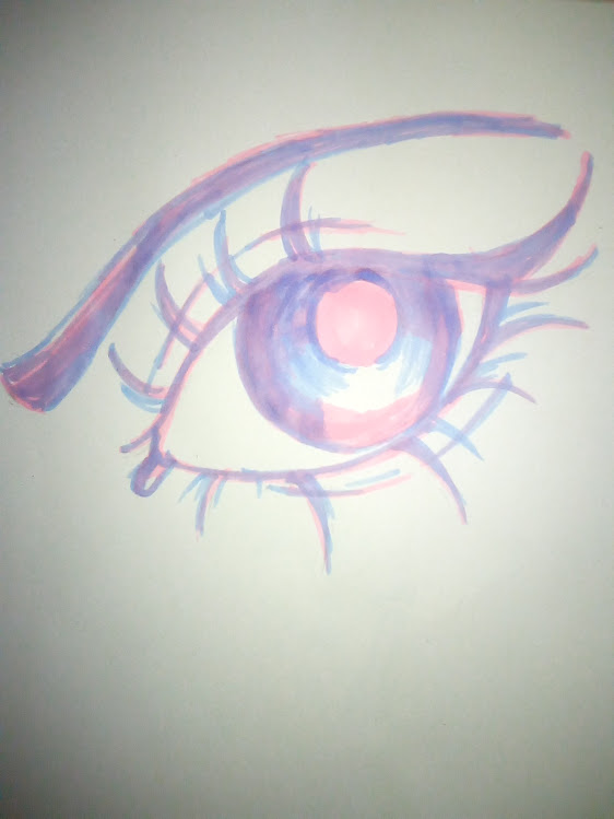
Decidí realizar un ojo para enfatizar la mirada con estos dos colores porque el bicolor-sketch se trata de practicar las líneas o los trazos imperfectos.
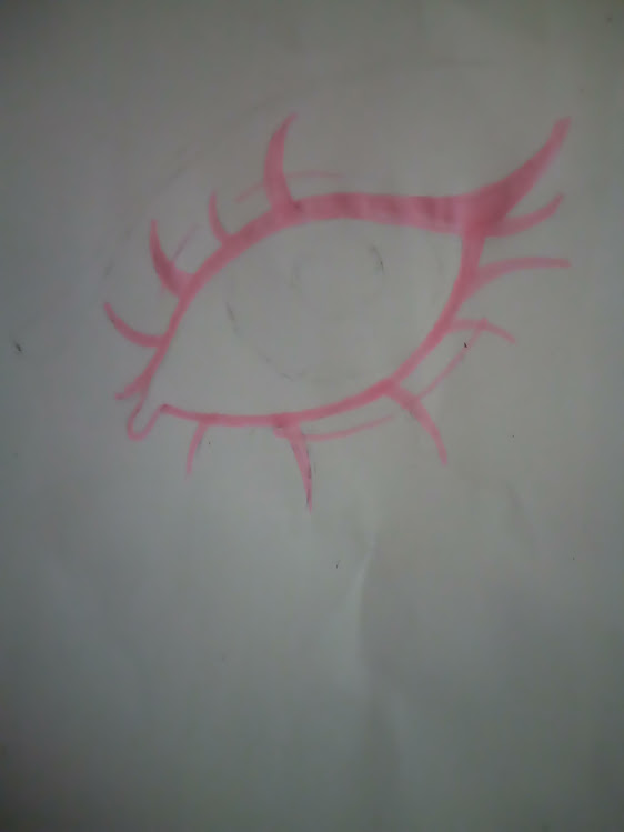
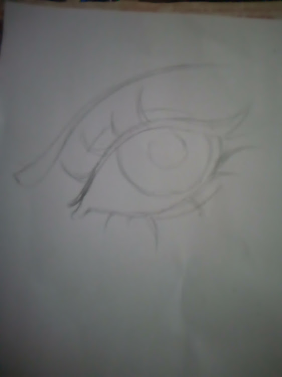
Comenzamos con el color más claro, el cual es el rosa, para que cuando coloquemos el morado se dé la forma al diseño y darle profundidad con el color frío.
El color base del boceto debe ser siempre muy claro para que el segundo color le dé el color o la intensidad al diseño y mayormente deben ser colores que armonicen para lograr un resultado único.
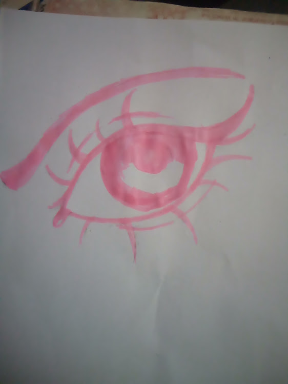
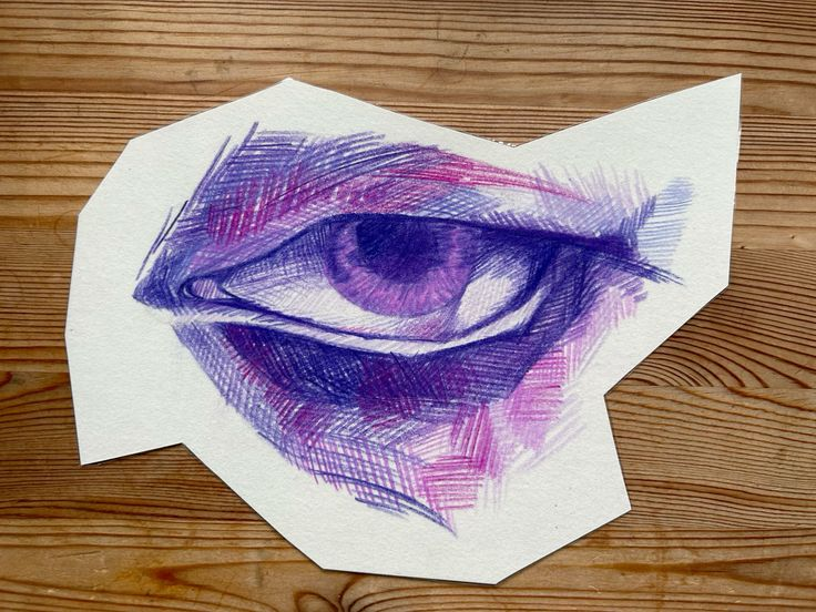
Como pueden apreciar una vez terminado todo el boceto en rosa es momento de colocar el segundo color que es el morado quien es que le da la firmeza al diseño y como pueden apreciar me alegra que si logre lo que tenía pensado al colocar este color.
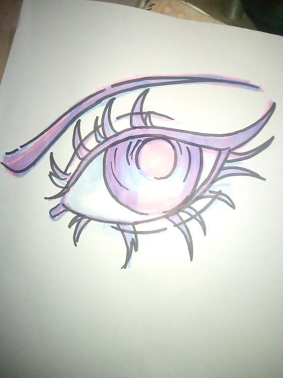
Me parece una técnica muy buena para bocetear sin miedo a equivocarte porque con el primer color haces la base del diseño y con el segundo el más fuerte corriges o defines más el diseño.
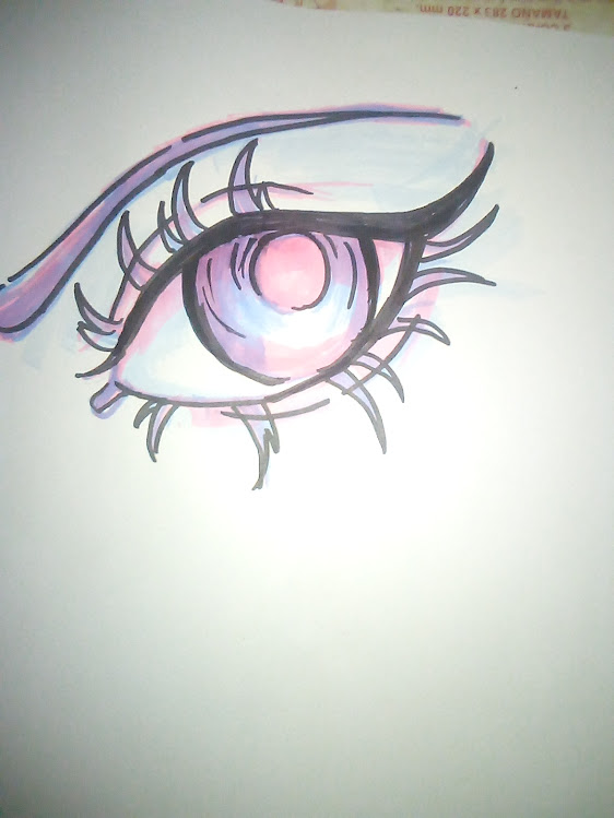
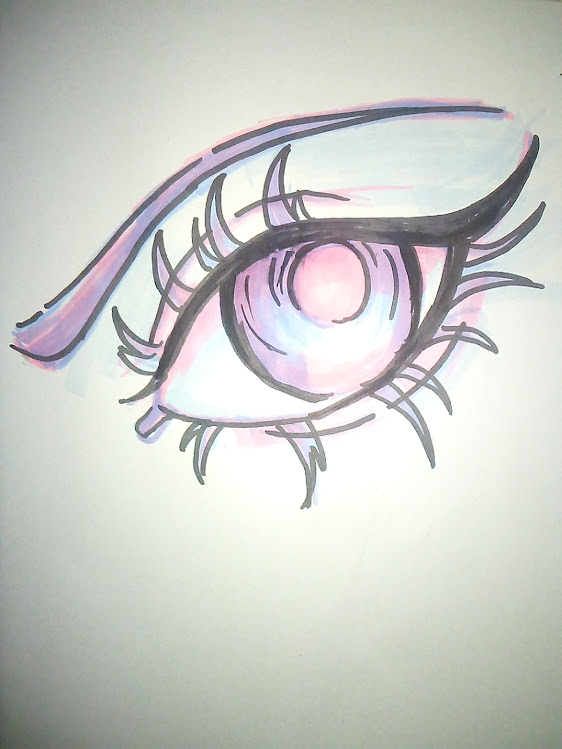
Una vez terminado quise ver como se vería todo delineado con negro, esto ya se sale de la técnica y con los dos colores quedaron muy bien, pero la curiosidad me ganó.

>! [ENGLISH VERSION GENERATED BY GOOGLE TRANSLATE]
>>###
|||
|-|-|
Una vez terminado ¿ustedes que opinan, utilizarian esta tecnica?

.................................................................
F U L L // A R T
.................................................................

***Considera unirte a nuestro trail de curación en HIVEVOTE haciendo clic en la imagen inferior, Les agradecemos todo el apoyo.***
[](https://hive.vote/dash.php?i=1&trail=takeru255)
**A todos los artistas ahí afuera en HIVE, si alguna vez se sienten solos y perdidos, únanse al [canal de Discord](https://discord.gg/BTH5VMj9HX) de Bokura No Digital World**
### ***Once again, we're exploring the two-color sketch style, which is a sketch or drawing that uses only two colors. These sketches can include abstract patterns with geometric shapes and lines or they can be more traditional illustrations.***
***In my previous post, we explored the colors red and blue. For this new project, I'm going to sketch with pink and light purple to see how these two colors interact.***
***These sketches are a form of art that can be simpler and emphasize contrast and composition through the limited use of color.***

[Example of a two-color sketch](https://www.pinterest.com/pin/398920479516060123/)

This technique is characterized by being mostly sketches, which gives us the freedom to draw lines and leaves us with an imperfect design. But that's precisely what makes it perfect. By combining two colors and placing them in specific locations, we can create a warm or cold color.
The most common colors are blue and red, but this time we'll use pink and purple. These two colors will be useful for making a simple sketch and starting this exploration. I'll try to be faithful to this technique, avoiding aesthetics a bit.

I decided to make an eye to emphasize the look with these two colors because the two-color sketch is about practicing imperfect lines or strokes.

We start with the lightest color, pink, so that when we add the purple, it gives shape to the design and depth with the cool color.
The base color of the sketch should always be very light so that the second color gives color or intensity to the design. The colors should mostly be harmonizing to achieve a unique result.

As you can see, once the entire sketch is finished in pink, it is time to add the second color, which is purple, which gives strength to the design and, as you can see, I am glad that I achieved what I had in mind when adding this color.

I think it's a great technique for sketching without fear of making mistakes because with the first color you create the base of the design, and with the second, the brightest, you correct or further define the design.
Once finished, I wanted to see how everything would look outlined in black. This is already beyond the technique, and with the two colors they turned out very well, but curiosity got the better of me.
|||
|-|-|
Once finished, what do you think? Would you use this technique?

.................................................................
F U L L // A R T
.................................................................


Grateful to all of you who are also part of my life. 💖
#### Well, from here I say goodbye, I hope you like my work like I do every day that I see and know that there are people dedicated to commenting on me and giving me encouragement to continue.  # ***May the light be the key that guides your hearts.***
#hive-130560
#neoxian
#pob
#spanish
#drawing
#enlace
#art
#diy
#waiv
#waivio
Payout: 9.599 HBD
Votes: 330
More interactions (upvote, reblog, reply) coming soon.