hey guys! I've been wanting to share with you two new works that are finished. I'm posting this as an entry to @w0olf 's weekly character design contest. I'll post the process and results here. this week's theme is following a style of a different artist and creating a character in this given style. I had three artists to chose either one or, to choose multiple artists. I only managed to do two characters in one style- that of the comic artist Mike mignola. Here are the two:
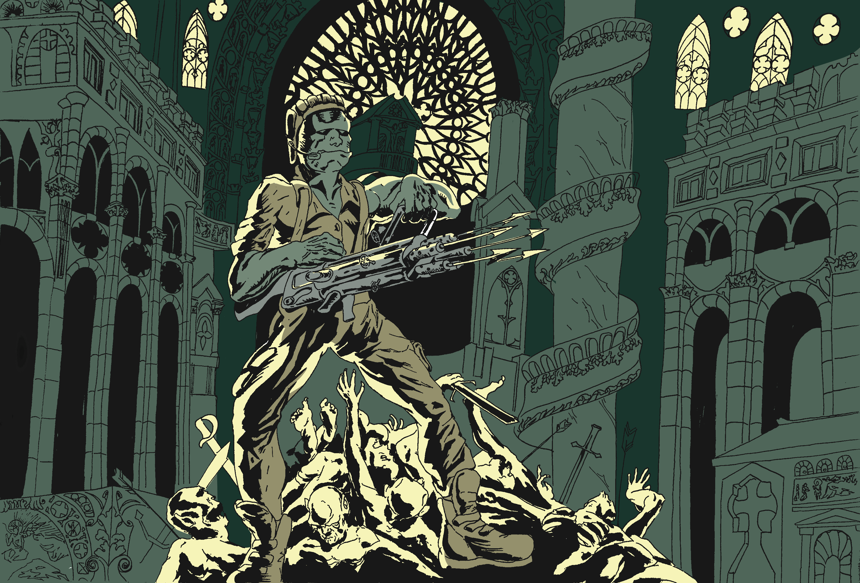
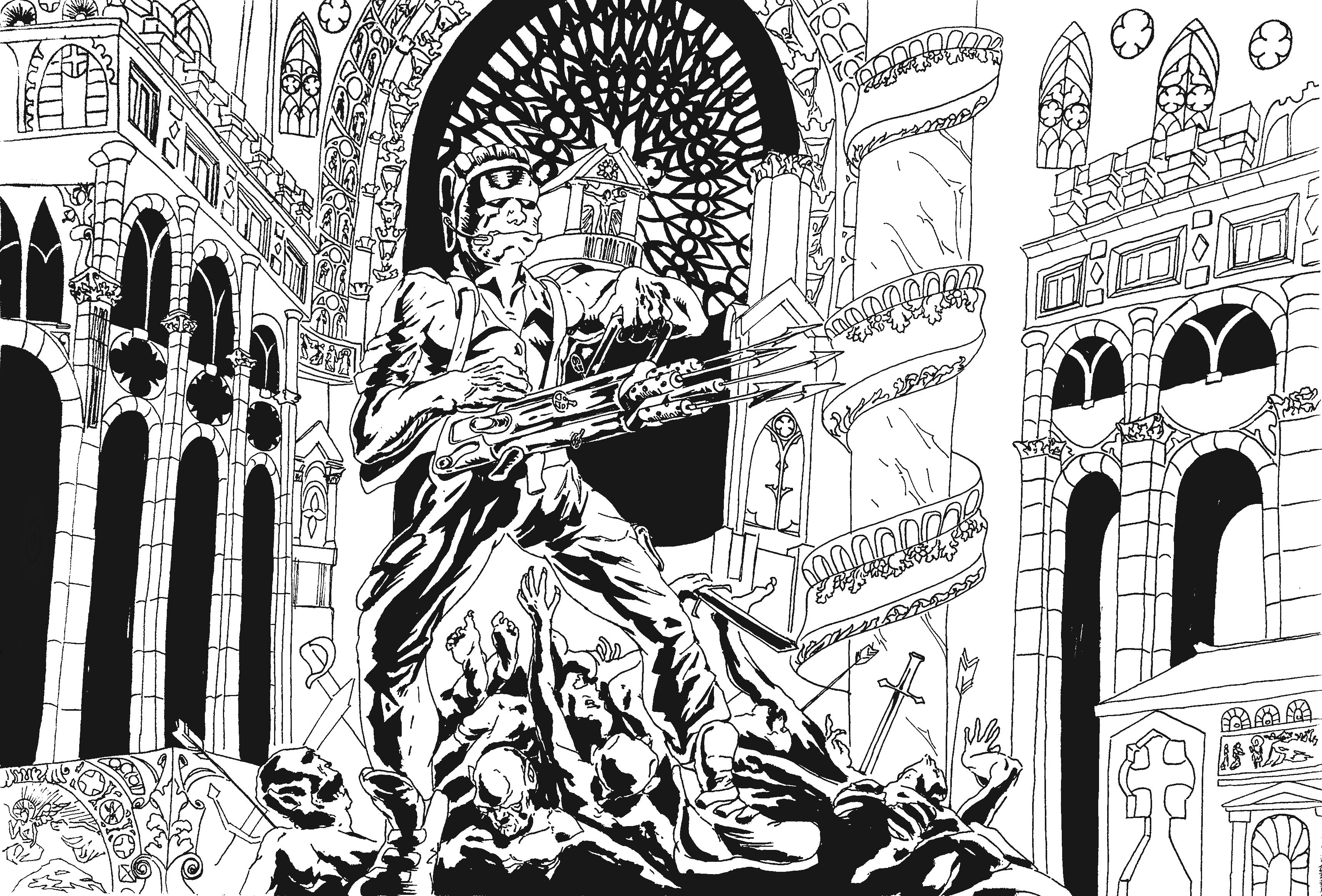
Otto
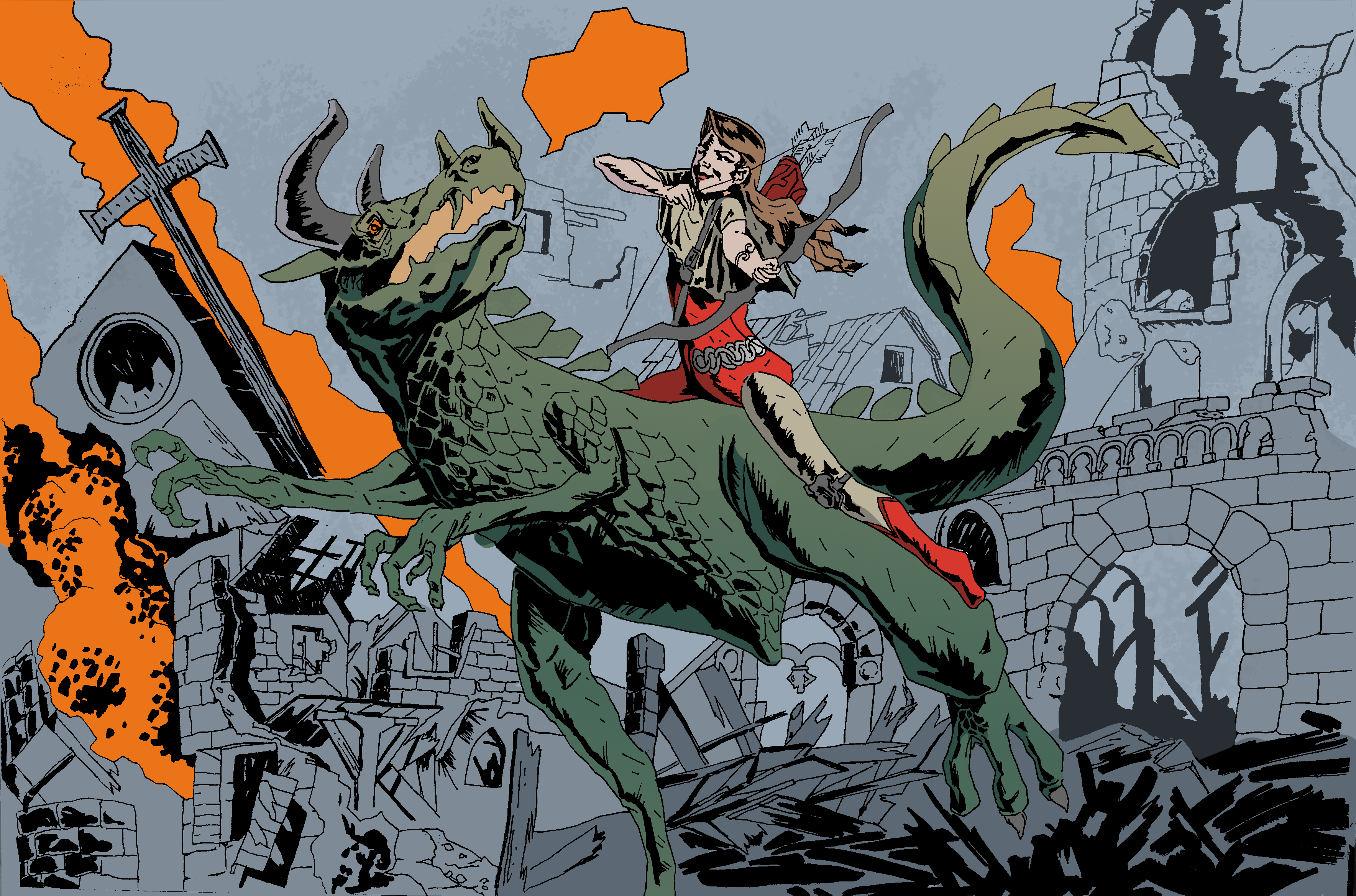
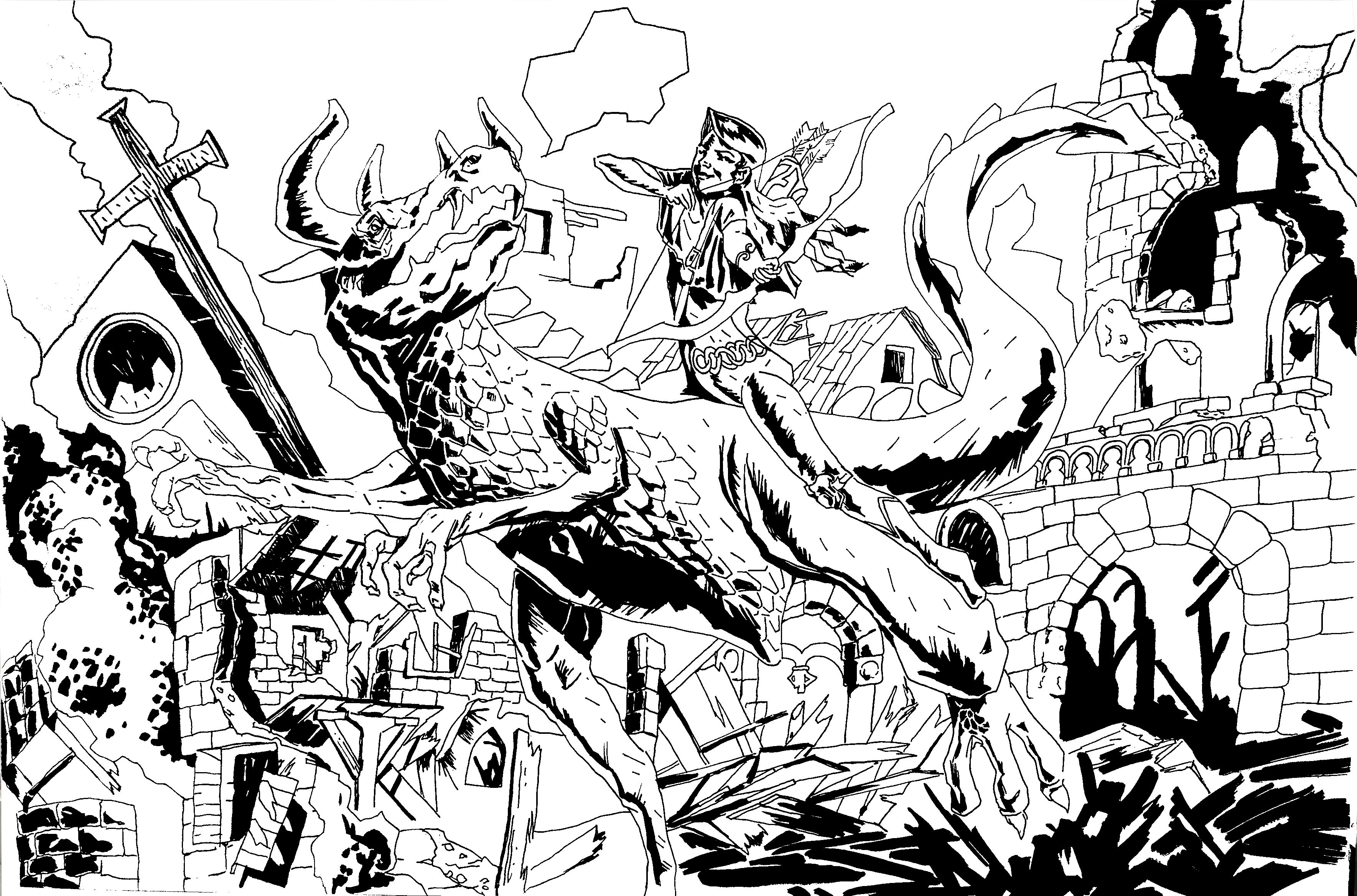
and Lianna
full res versions: https://ibb.co/cDgC9x https://ibb.co/gE7Kpx
to be honest I didn't know Mignola before I've looked it up but I did know the character "Hellboy" from the movie franchise. I also did know Hellboy, probably Mignola's most known character first appeared in comic books. getting to know Mignola's work from doing a search, I must say that I really like his approach. the fact that it has many things that click with the way I usually draw myself, like the dark undertones and emphasis on the dramatic lighting of the scene. Also, his dark fantasy/action themes are ones that I really connect with in my imagination.
Here are a few points that I've taken from analyzing his style: • His value key is often very dark and it looks as if his subjects "appear" off of the shadows. • resolute and crisp lines, minimal strokes, "anonymous line" (same width across) • exaggerated figure proportions, somewhat on the grotesque side • dynamic compositions • solid core shadows • mostly desaturated colors.
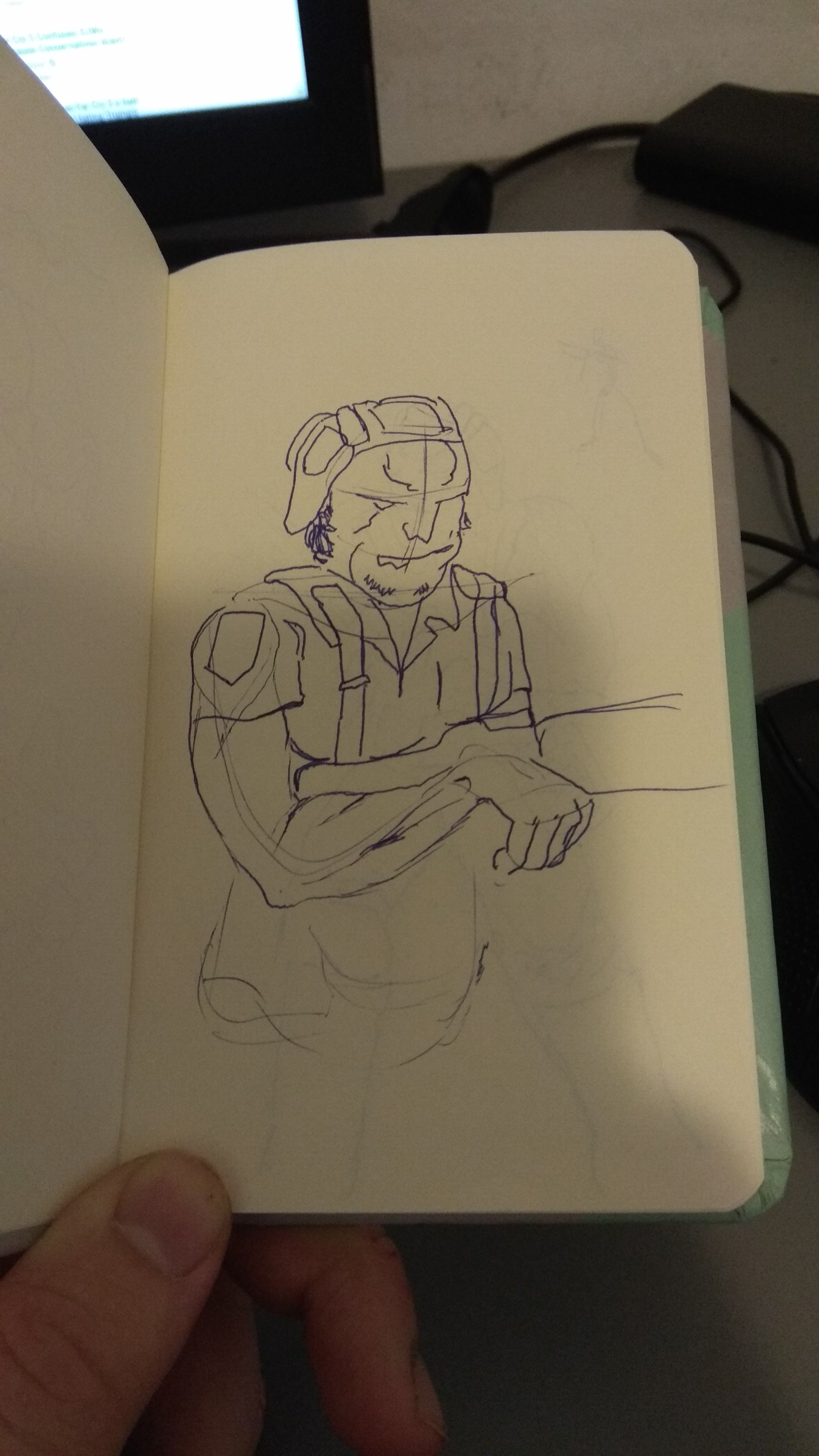
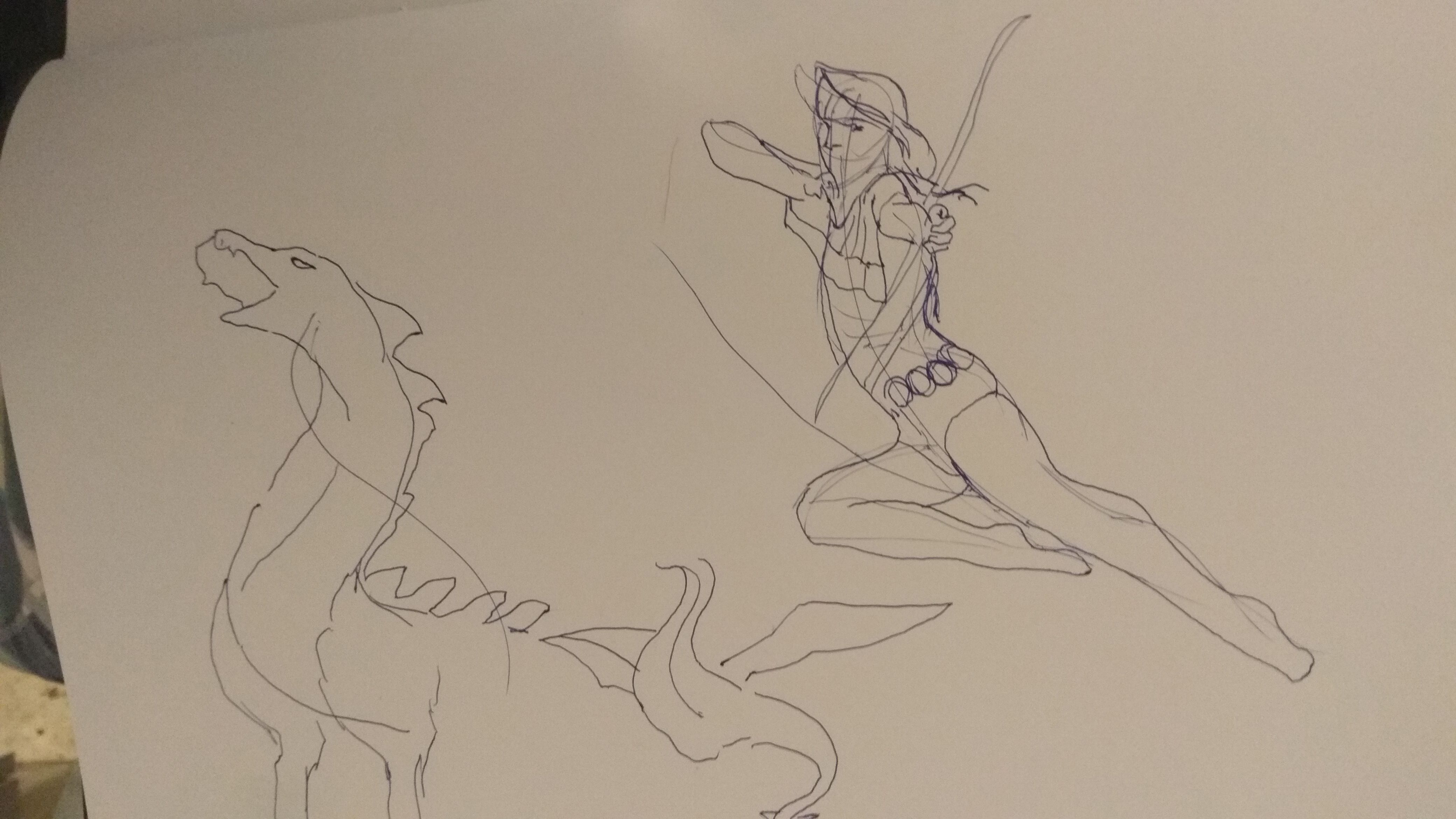
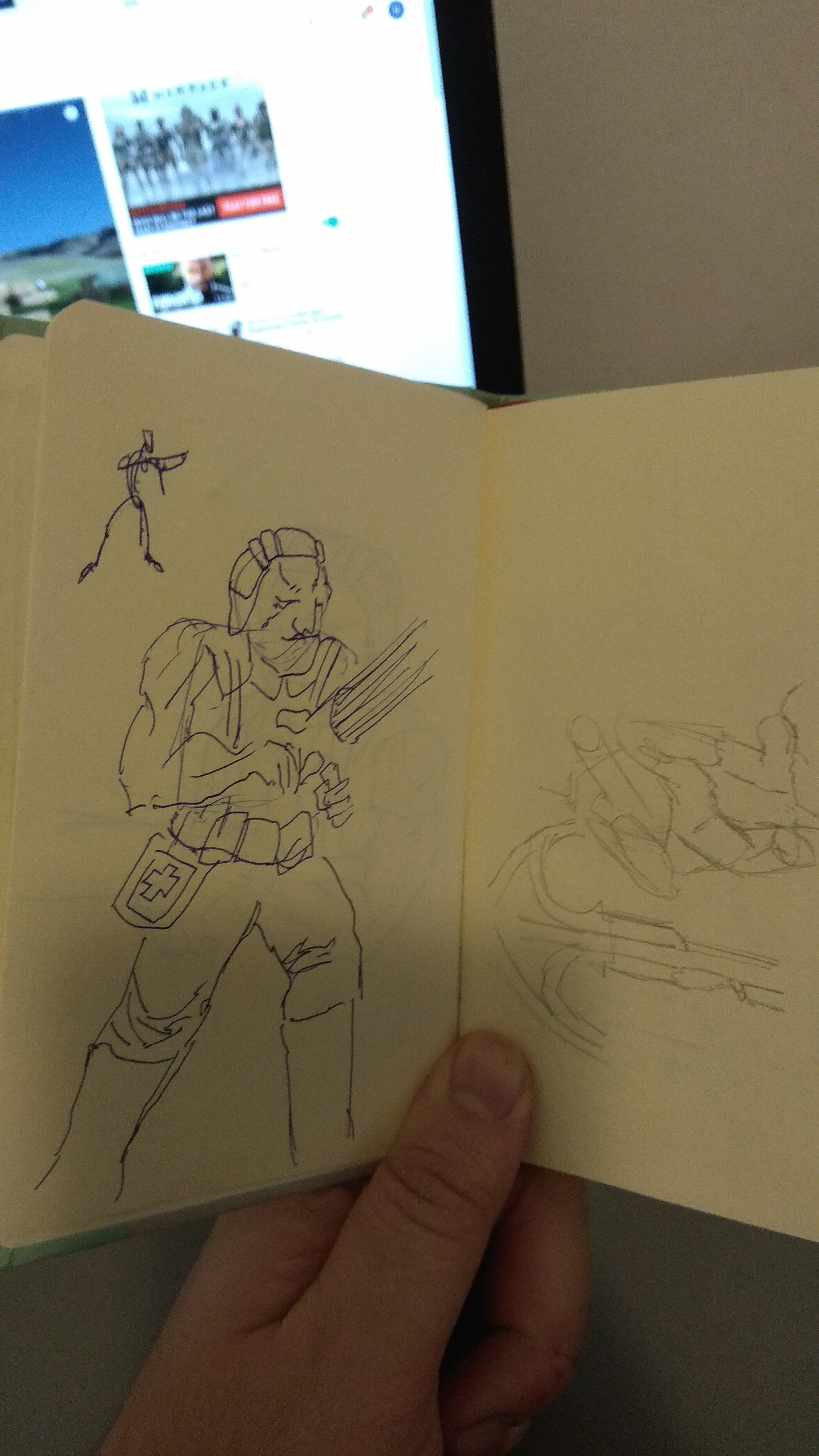
I've ripped the colors (sampled) right off of Mike's images shamelessly as I felt it was solid grounds to stand on when it comes to color. here are the rough sketches:
First of all, I inked the drawings with a rapidograph pen (0.5 point tip and a flat brush one). I used a watercolor water-brush pen, filled it with India black ink instead of water and colored in the large black spots. I took it over to Photoshop, add a "threshold" layer, and put an "overlay" layer between the two layers- to brighten or darken the areas that the threshold effect loses.
when I get all the lines I've intented to get, I put on the color layer in overlay mode,
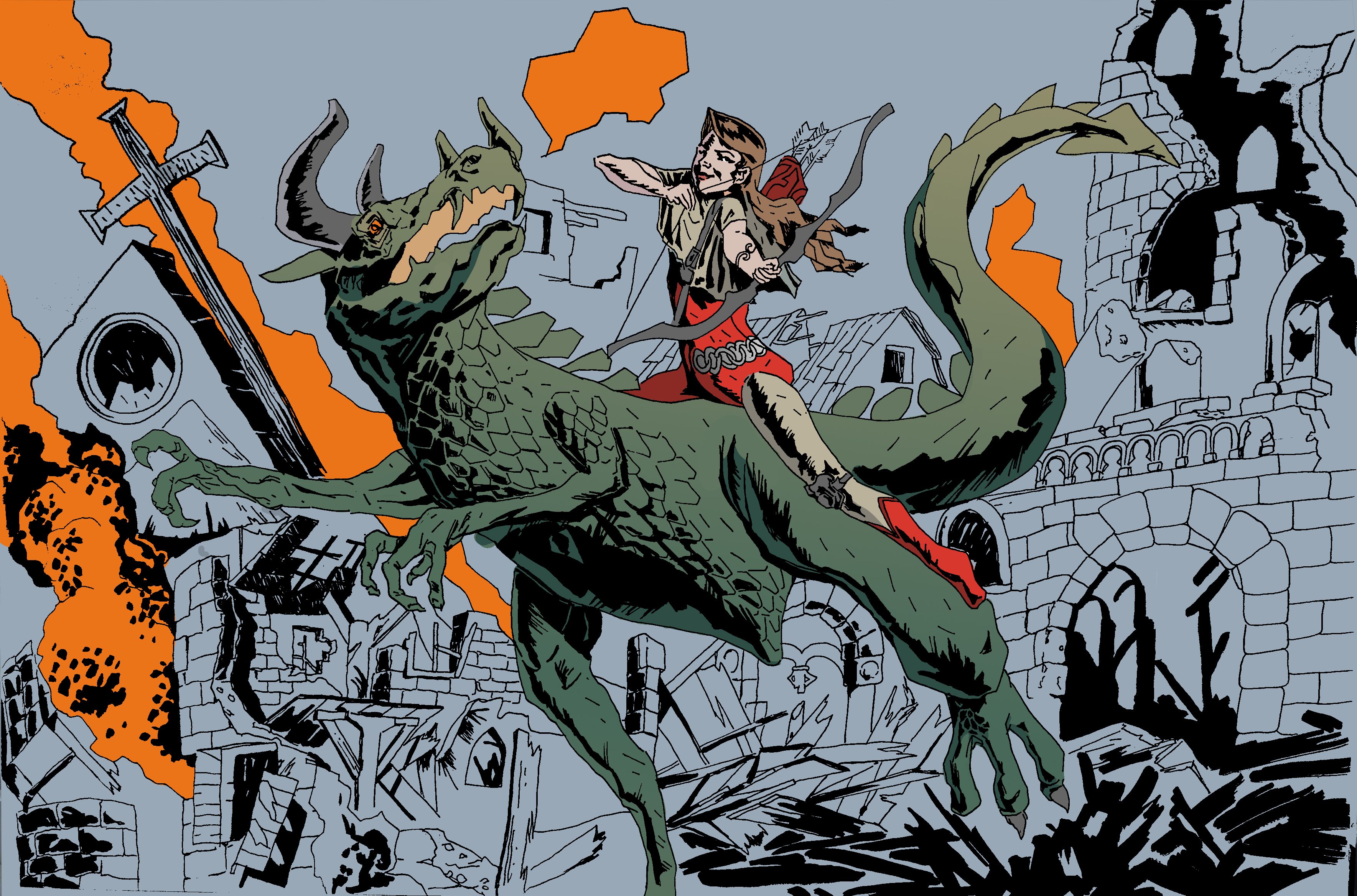
I added another layer of color and a slight texture (overlay layer) in which I used a large scatter brush to paint a few strokes. I've set the opacity of the texture layer to about 30%. I've used a costum brush but you can use the defaults, I don't make extensive use of special brushes in Photoshop.

Anyway, I hope you find this post interesting or useful and feel free to critique my work or make a suggestion/request in the comments. as always I thank you fellow steemian for supporting me through this platform and giving me a place to present my work in. and thanks to @w0olf for hosting this contest and introducing me to so many talented people on steemit. have a great weekend!