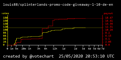
In first tests I noticed that you can hardly recognize the votes in a diagram generated from a new posts, when 7 days are displayed with even scaling. Therefore I have adjusted the scaling.
Most of the votes are already given in the first few hours and after 1-2 days the curve starts to flatten.
So I stretched the first day in the diagram and compressed days 3 to 7.
This is a diagram generated with the new scaled axis.
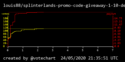
and this was the old version:
You can read more information about my upcoming votechart service here: https://peakd.com/votechart/@votechart/votechart-graph-of-votes-over-time