Last time I set myself some tasks to complete for the mobile version of my portfolio page: * Welcome screen - 1) font size, 2) design; * Projects - 1) make it scroll horizontally, 2) re-design cards, 3) deploy projects on Netlify && 4) change links on the portfolio site;
So I'll put on some music and get started.
{{ Welcome screen }}
 (Things are quite off viewed on a 320 x 640 screen).
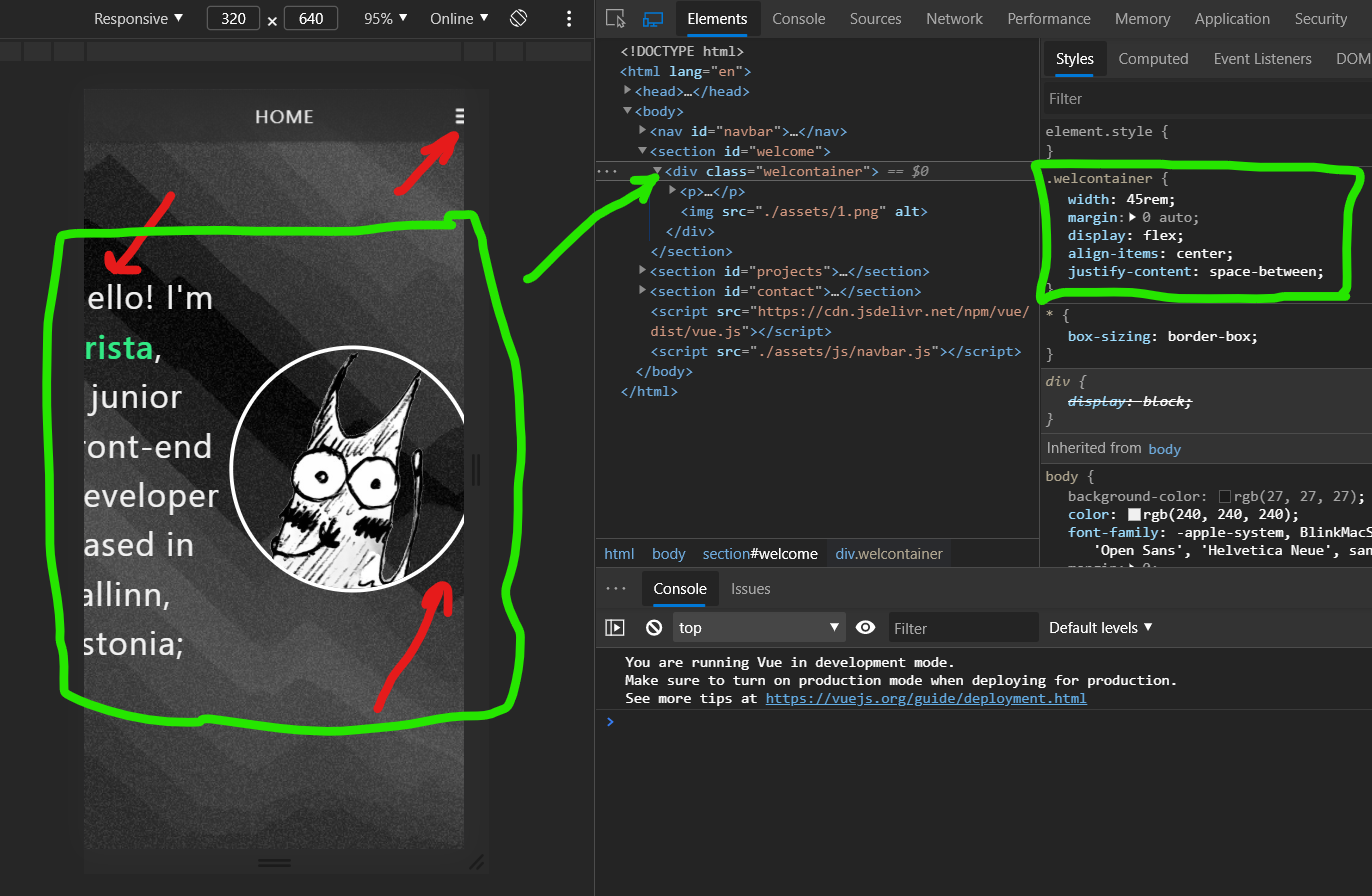
I whip out the site on a new tab, open up the Edge DevTools (yes, I use Edge), toggle the device toolbar and what do I see? Things are a bit off (red arrows on the screenshot above). The hamburger menu button is a bit too much to the right, the text is cut off on the left and the image on the right.
My first reaction is to inspect the container both the text and image are in (in my case it's a div element with the class "welcontainer", green boxes in the screenie).
I toggle the "width: 45rem;", nothing happens. I toggle the "display: flex;" - A-ha! It fixes all three things that were off. But am I going to remove flexbox from the container? No.
What I'll do instead is add "flex-direction: column-reverse;", and it works like a charm! The content fits between the borders of the screen and the image is displayed above the text. Still, I feel the image and font sizes are a bit too big so I make them a little smaller (font-size to 1.4rem, image width to 10rem, container width to 13rem).
Looks pretty good already, right? But it's missing something... something that would call the site visitors to scroll down. I've thought of adding a simple arrow pointing down but I heard they're ''the lazy man's way out'' and instead it's good to reveal a tiny bit (or just the tip 😏) of the following content to give people a little FOMO (if I don't scroll down, I'll never know what's there). I was thinking of playing with the background a little - like have the transition from the welcome section to the projects section have a wave between them instead of a straight line where the background image of the prior ends.
How do I do that, though? One way would be to edit the background image - cut a wave off from the bottom part of it, but then it might look weird on different screen sizes. Another way is to create a wave shaped SVG (there are several SVG wave generators that give you both a downloadable SVG file and a copy-pasteable SVG element). Or I could just create a wave image divider and position it right where it needs to be (meaning I'd have to tweak it's position a bit on different media queries).
I think I'll leave the wave thing for another time and move on to making the projects horizontally scrollable.
{{ Projects }}
Since I'm not quite sure how to make cards horizontally scrollable, I ask for help from the good ol' reliable Google and get an answer right away: a post by Colin Lord on Codeburst's Medium. The first thing he suggests he calls ''The white-space method'' but that's not what I'm looking for. I like to flex, so I turn to ''The Flexbox method''.
All I had to do was to make the cards wrapper not wrap and to have an overflow of auto on the x axis, plus add "flex: 0 0 auto;" to the cards class. I also hid the tiny scrollbar that appeared under the projects when scrolling from left to right and vice versa (::webkit-scrollbar).
Last but not least, I had to remove my previously set justify-content and align-content properties from the wrapper, else one of the projects wouldn't be displayed and I would've been scrolling along 2 projects instead of 3.
With that done I'm going to take a break and continue tomorrow. Not totally sure if I'll do it the same way as today, though (writing code and a post about coding at the same time) - it takes ages and my brain just stopped responding.
So let's push commits, review the task list and call it a day
- Welcome screen - ~~1) font size~~ ✔, 2) design - ~~buggy look on tiny screens~~ ✔, make a call-to-scroll for the visitors;
- Projects - ~~1) make it scroll horizontally~~ ✔, 2) re-design cards, 3) deploy projects on Netlify && 4) change links on the portfolio site;